Download
This section provides access to various official versions of the brand logo and available patterns for use across all design and visual areas.
Please note that in order to maintain visual consistency across all brand touchpoints, use the versions included in the downloadable file.
Logo & Pattern
Updated 30/04/2026Sign
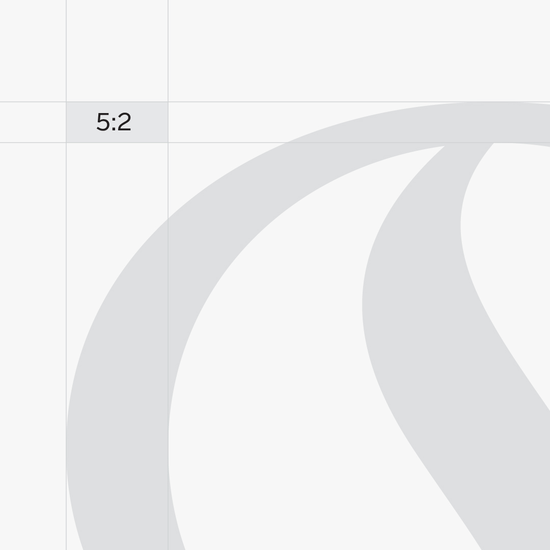
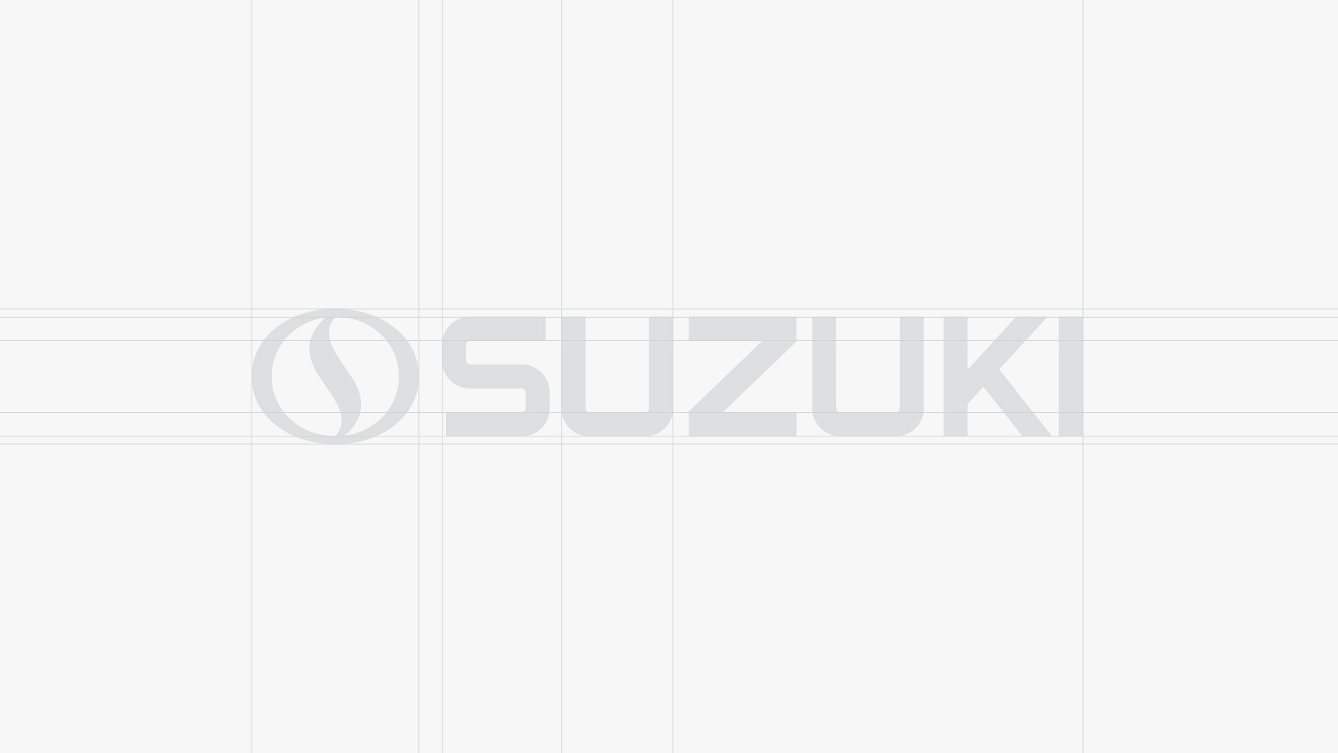
The Suzuki Sign has been redesigned based on a precise and controlled geometric structure to convey a sense of stability, reliability and seriousness in line with the brand's spirit, while also being visually beautiful. In the structure of this logo, the use of precise mathematical proportions to control thicknesses and the proportion of visual weights are important points.

English Wordmark
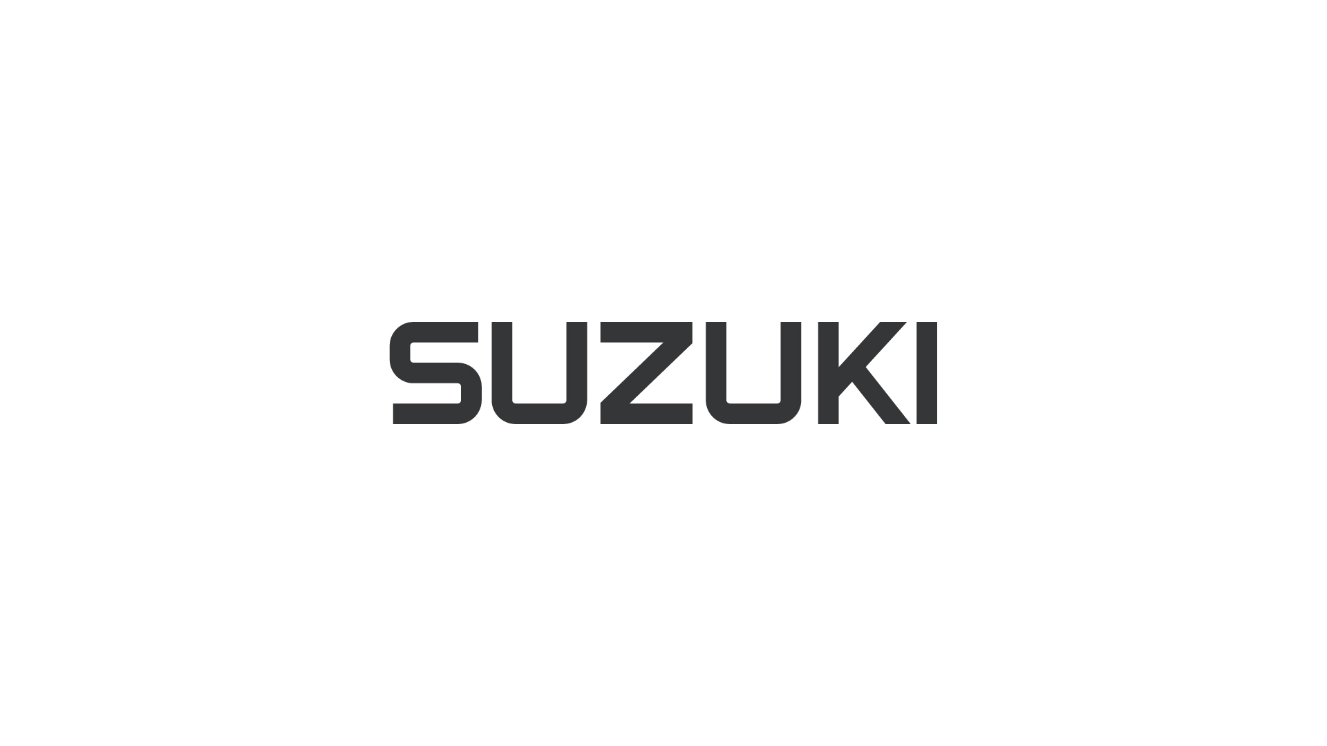
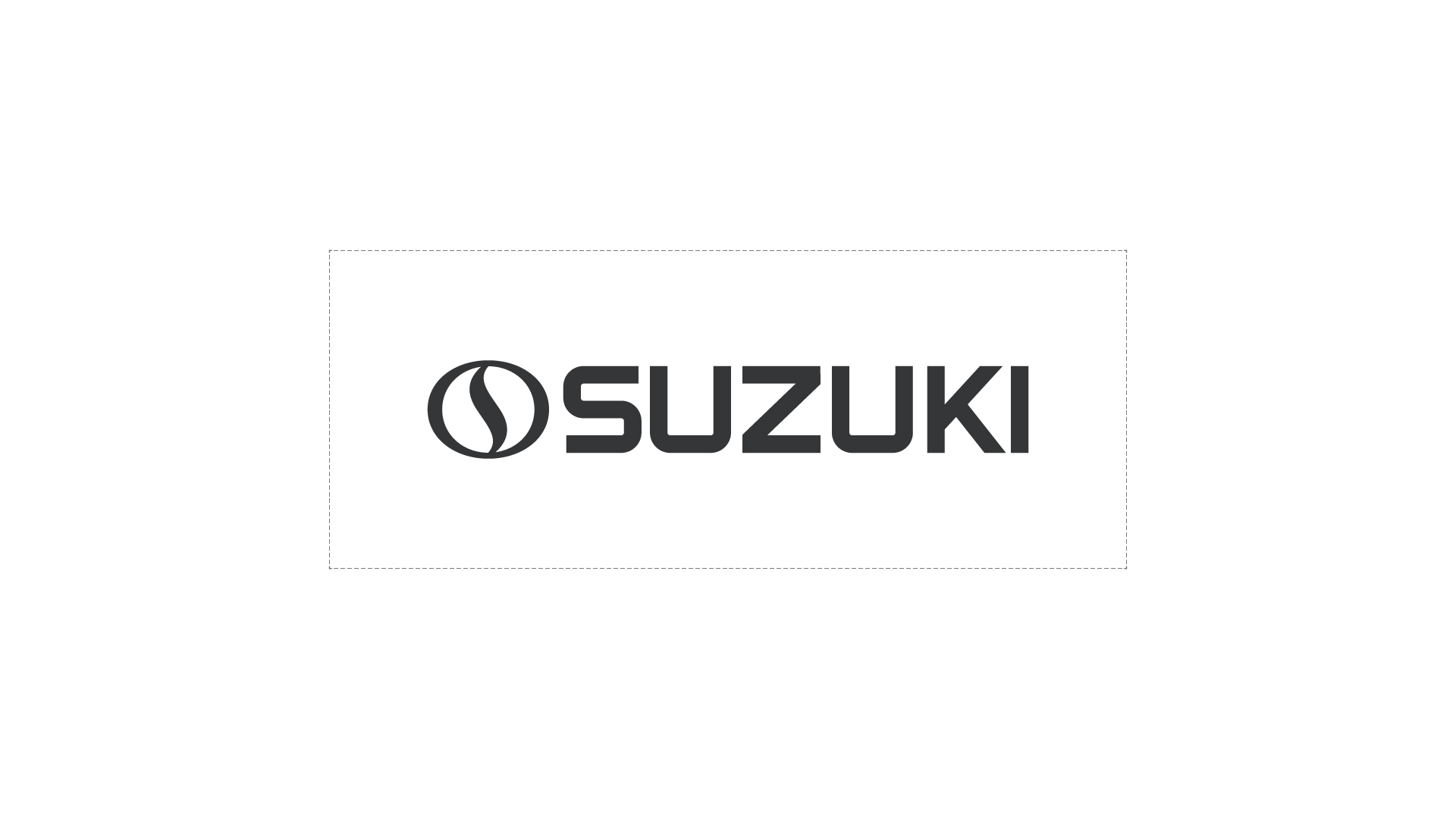
Suzuki's English wordmark has been redesigned, building on the typographic structure of the previous typeface. In the redesign of this typeface, while focusing on a structured repeating pattern for the redesign of each letter, creating a harmonious and beautiful sequence between the letters was also a key consideration. The simultaneous use of sharp and rounded angles has also strengthened the formation of a coherent typeface.

Persian Wordmark
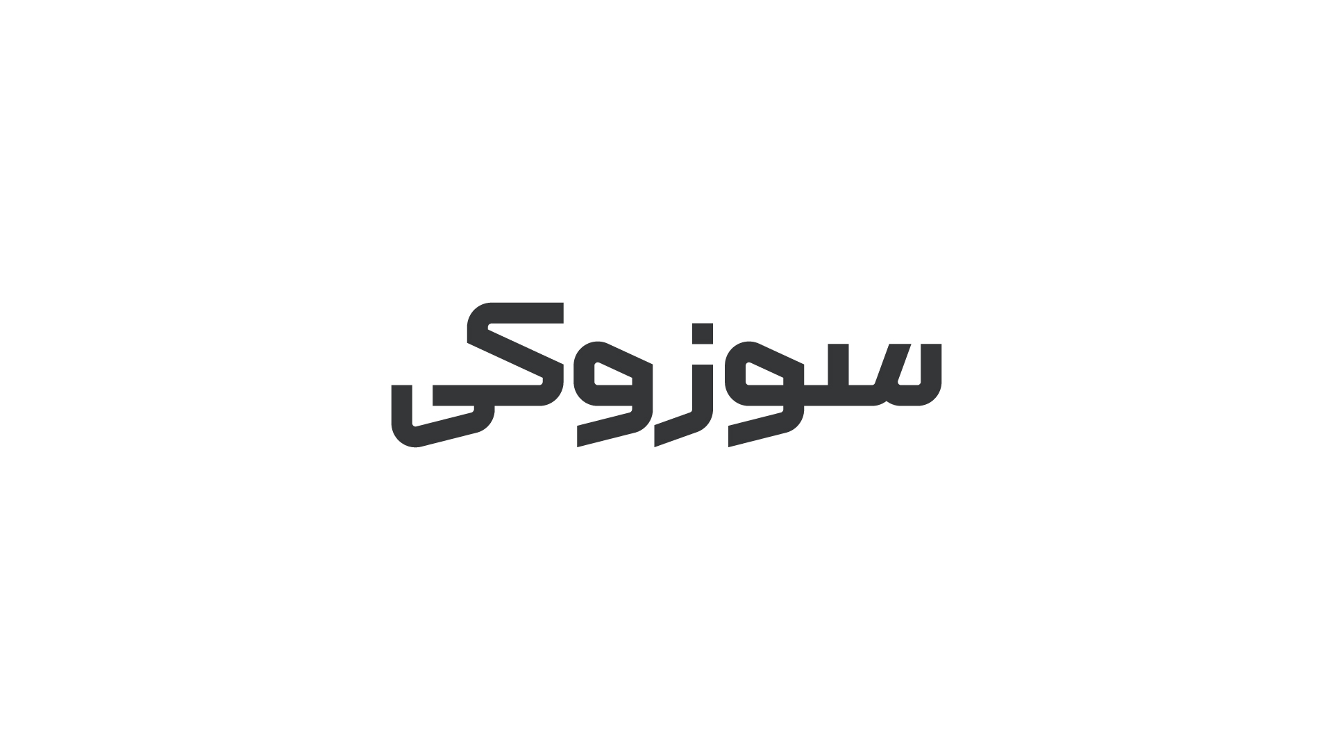
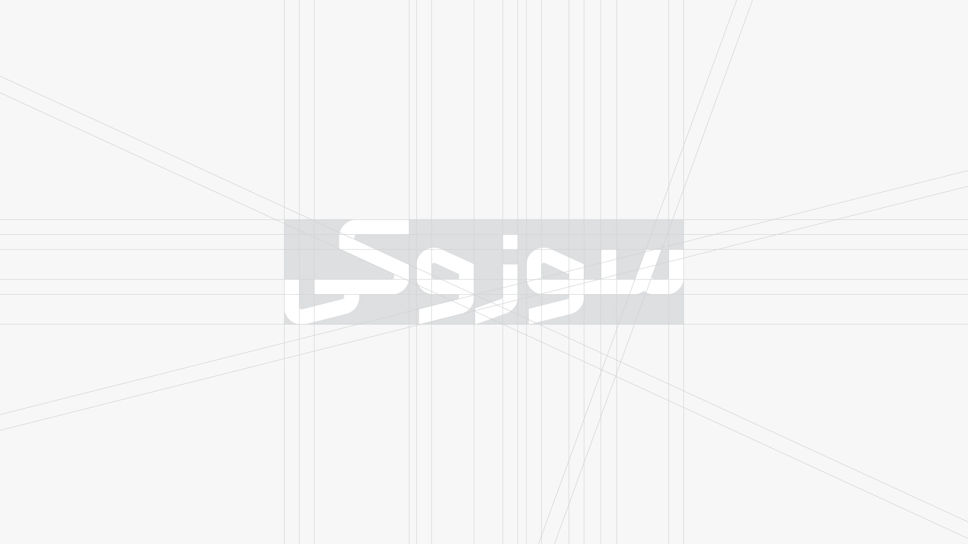
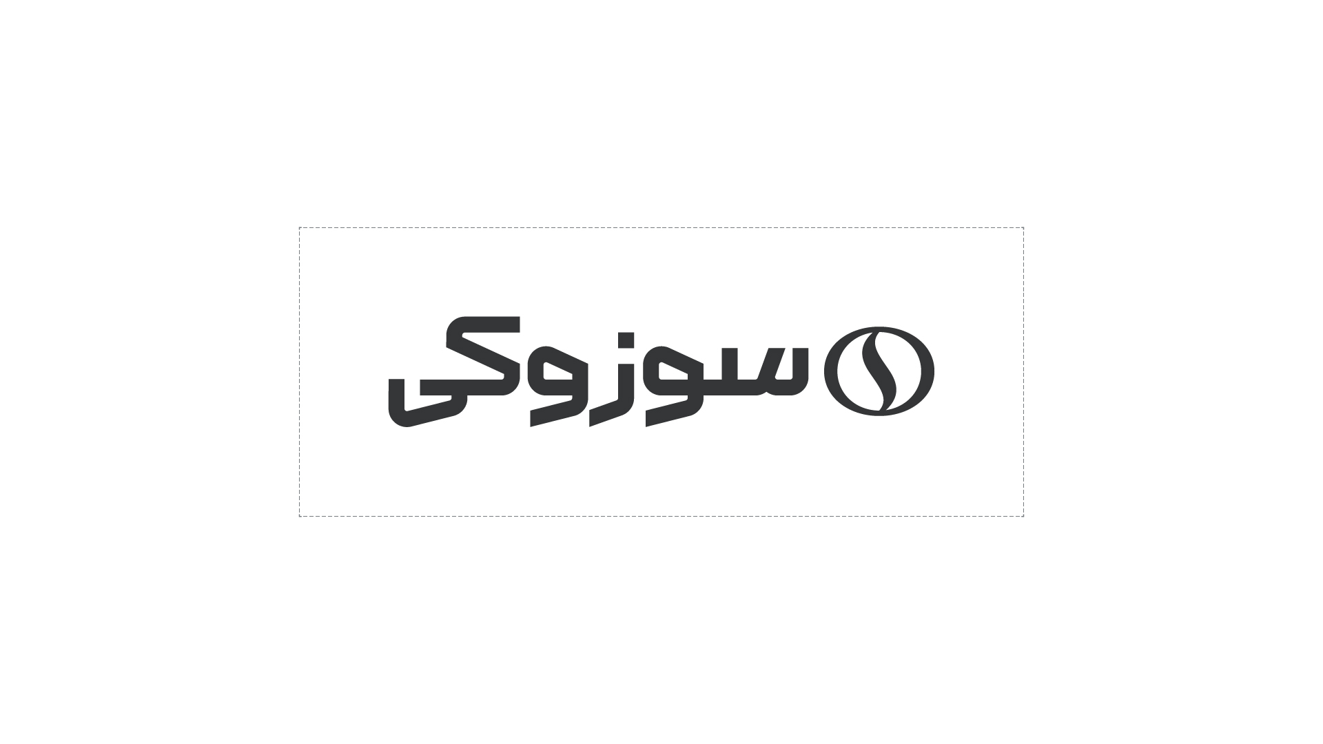
In the Persian version of this wordmark, the main focus has been on creating a common chapter between the Persian and English versions, with a touch of family resemblance. Using the angles of English letters and placing these details in the structure of Persian writing is one of the most important points used in this script.
Logo Lock-ups
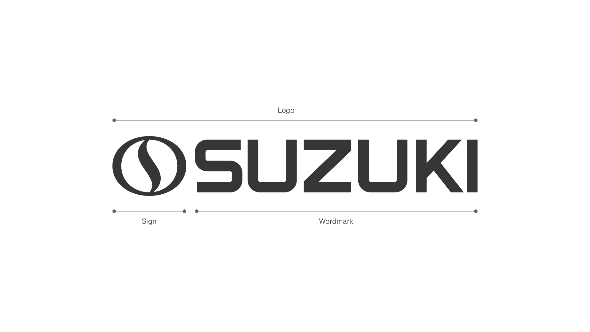
The Suzuki logo is a combination of a sign and wordmark. For practical reasons, the logo has several versions. Each version is designed for different conditions and media to remain legible, recognizable and consistent with the brand’s visual identity. The different versions of the logo allow for use in a variety of sizes, backgrounds and spaces, helping to maintain brand consistency across all touchpoints.





Using Together
The primary representation of the brand is the complete logo, consisting of both the sign and the wordmark. This configuration should be used in all standard applications to ensure consistency and recognizability.
In specific cases where spatial, functional, or contextual constraints apply, individual components of the logo may be used independently. These exceptions and their correct usage are defined in the sections below.
Main Lockup
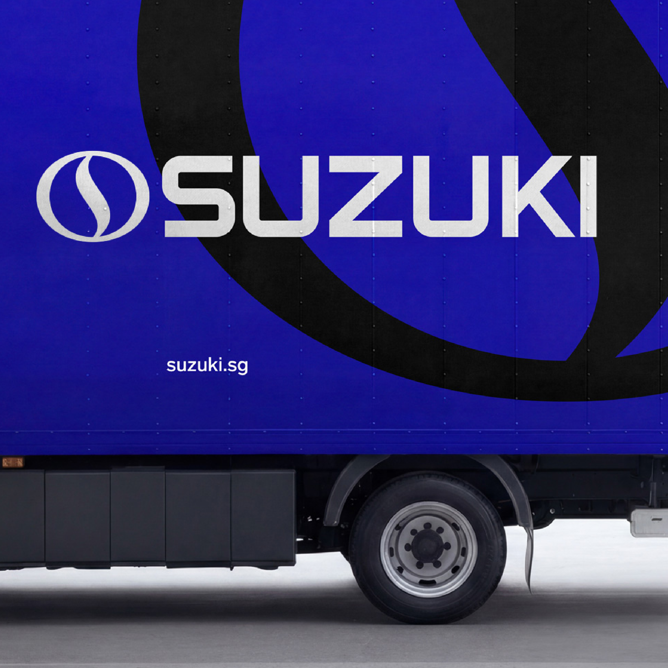
The main lockup is the primary and preferred version of the logo, used in all standard applications where clear brand presence and immediate recognition are required. It should be used by default across touchpoints, without alteration or obstruction, unless specific constraints necessitate an alternative version.
Sign (Standalone Usage)
In applications with limited space, the sign may be used independently as a compact representation of the brand. This version is suitable for contexts such as favicons, social media profile images, and other small-scale placements where the full logo is not legible.
Sign (Large-Scale Usage)
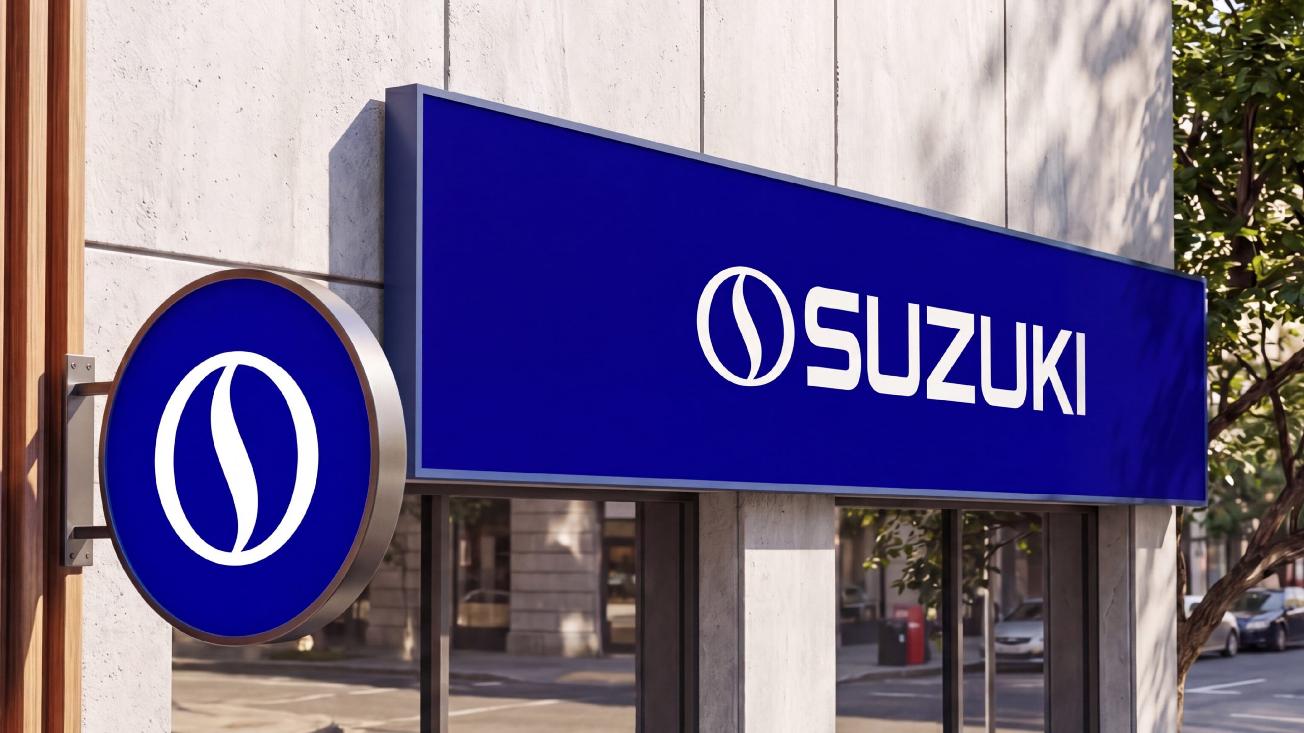
The sign may be used at large scale only when the full logo (sign + wordmark) is also present within the same product or visual environment. In these cases, the full logo serves as the primary identifier, while the enlarged sign functions as a supporting visual element.
The sign must not replace the full logo in large-scale applications where brand introduction is required.
em Box
The em Box is an imaginary square whose size is equal to the size of the text. All letters are designed within this area. The height of the two text may not be equal to each other or even slightly higher, but the reference for measuring and positioning the two text facing each other is the em Box.


Clear Space
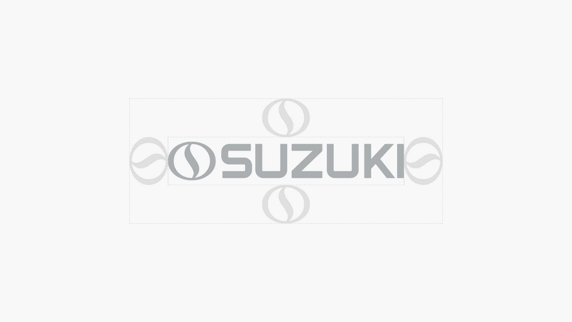
The safe space is the area around the logo that should not contain any graphic or text elements. This space ensures that the mark remains clear and recognizable and that the brand identity is not overshadowed by other elements. In the Suzuki sign, the safe space is determined by the height of the visual mark and must be respected in all cases of use.

Scaling Principles
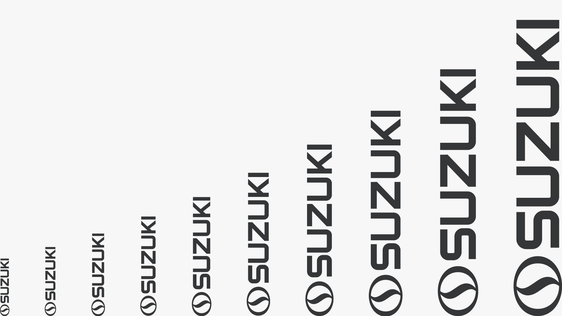
To maintain the designed written form throughout, tokens can be used in both uppercase and lowercase context. Always consider audience, communication, and tone. In larger segments, it shows a stronger presence while smaller reviews are more reserved and digital platforms.
Partnership
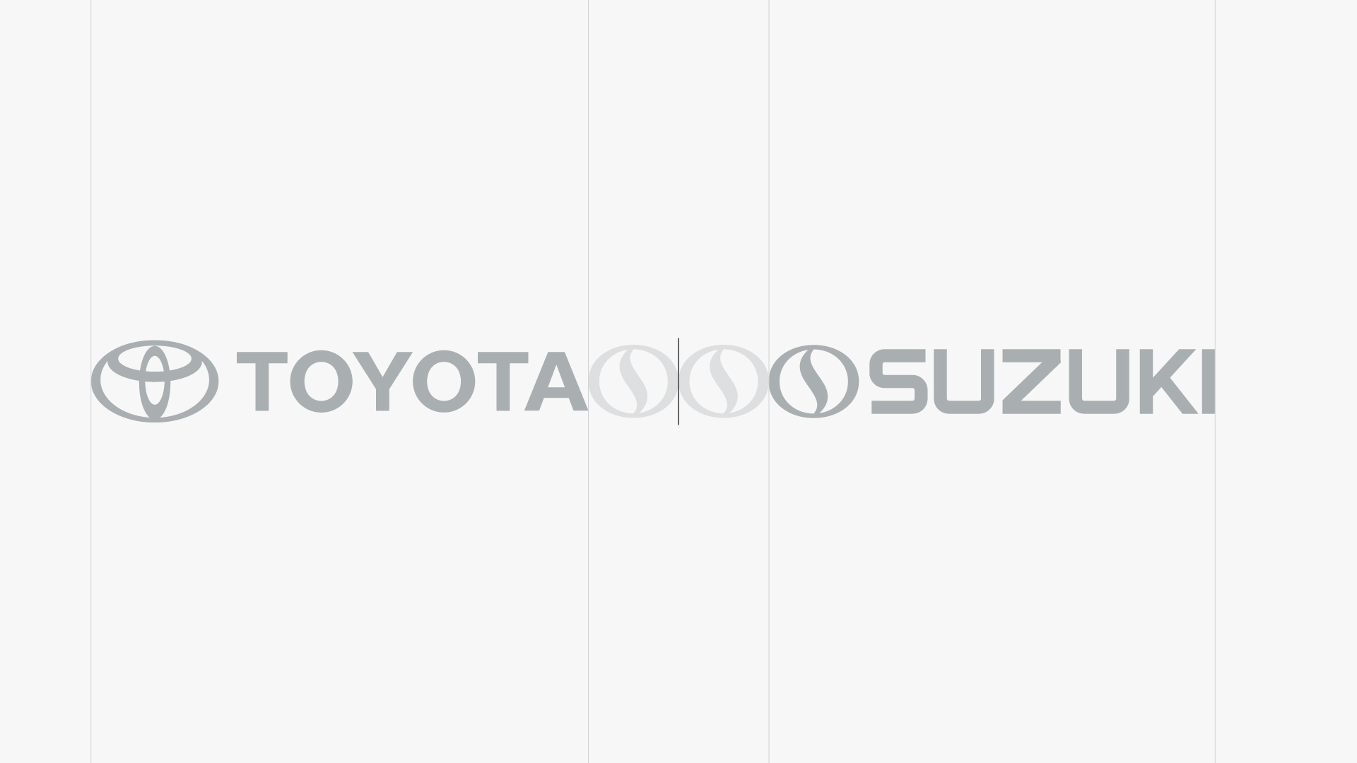
In cases where the logo is used as a business partner, the logos must be positioned in such a way that their distance from the dividing line is the same as the width of a sign.

Colors






Logo Crimes