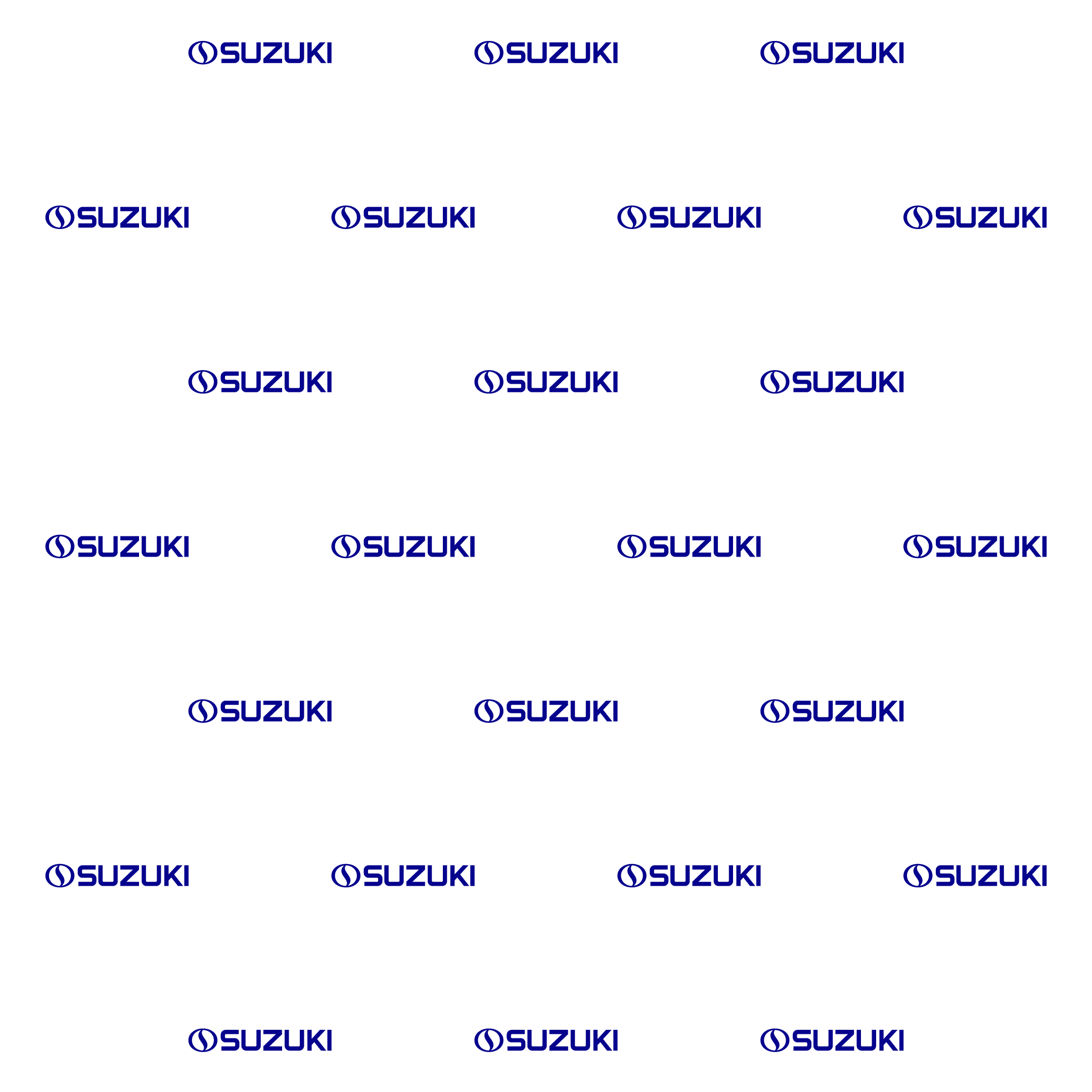
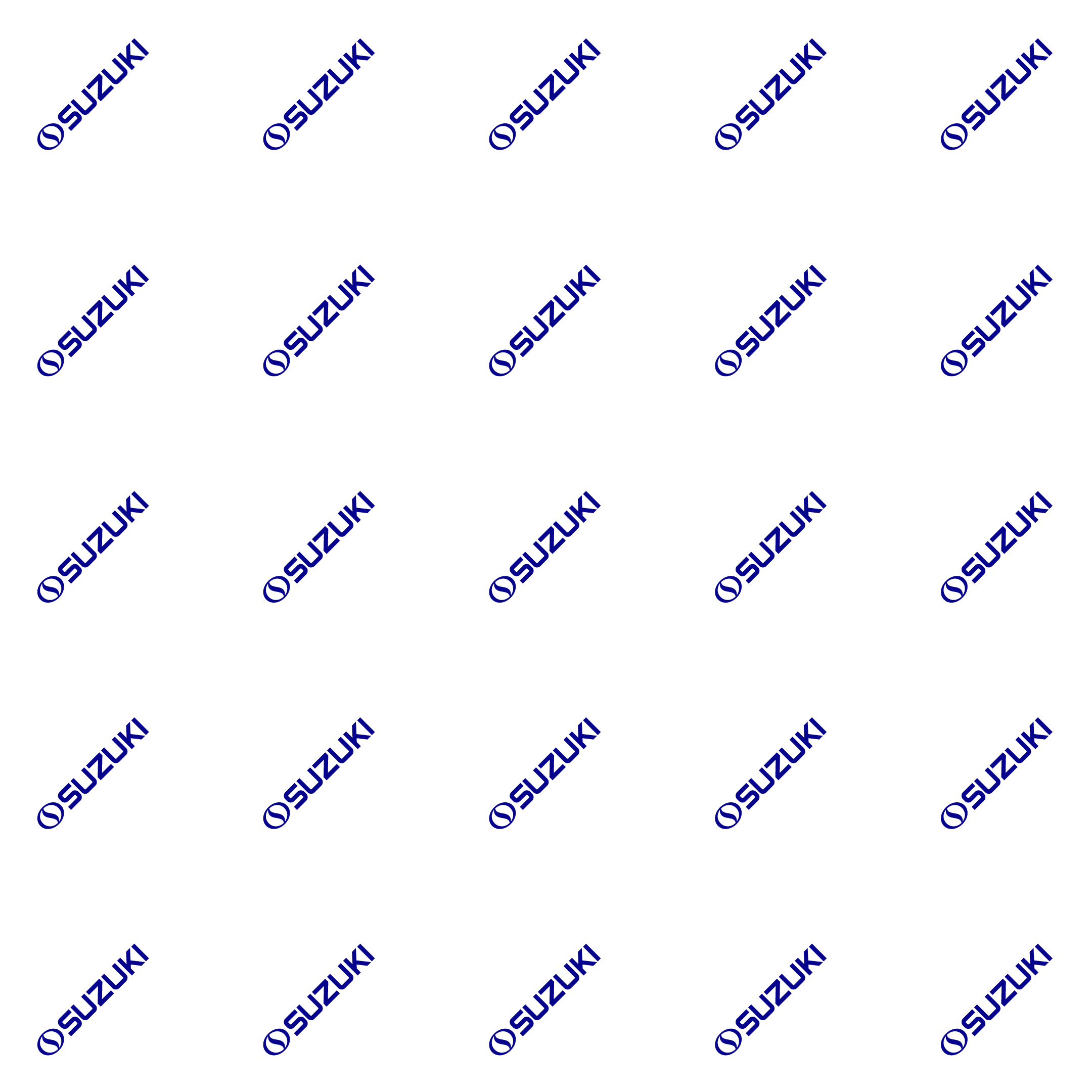
Pattern
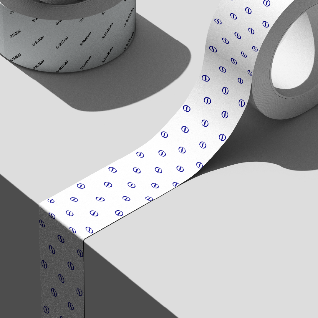
Pattern in brand identity serves as a repeatable visual system that reinforces recognition and coherence across touchpoints. In Suzuki’s brand identity, patterns are often derived from regular geometry and the brand sign and logo, reflecting precision, movement, and engineering clarity. These structured, modular forms support consistency across packaging, digital media, and environmental graphics. As a result, pattern is no longer decorative, but becomes a strategic asset that reinforces brand memorability and unity.



Stationary
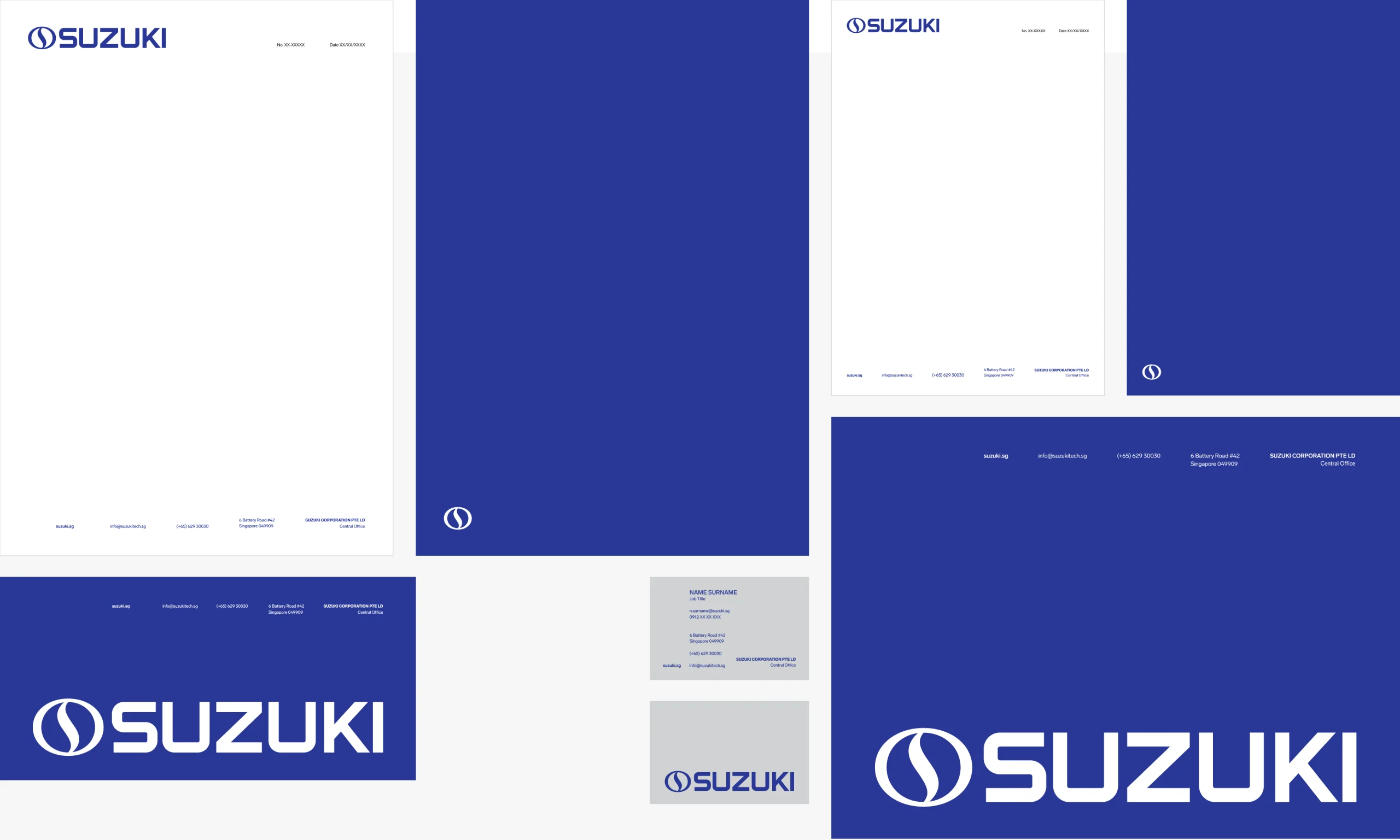
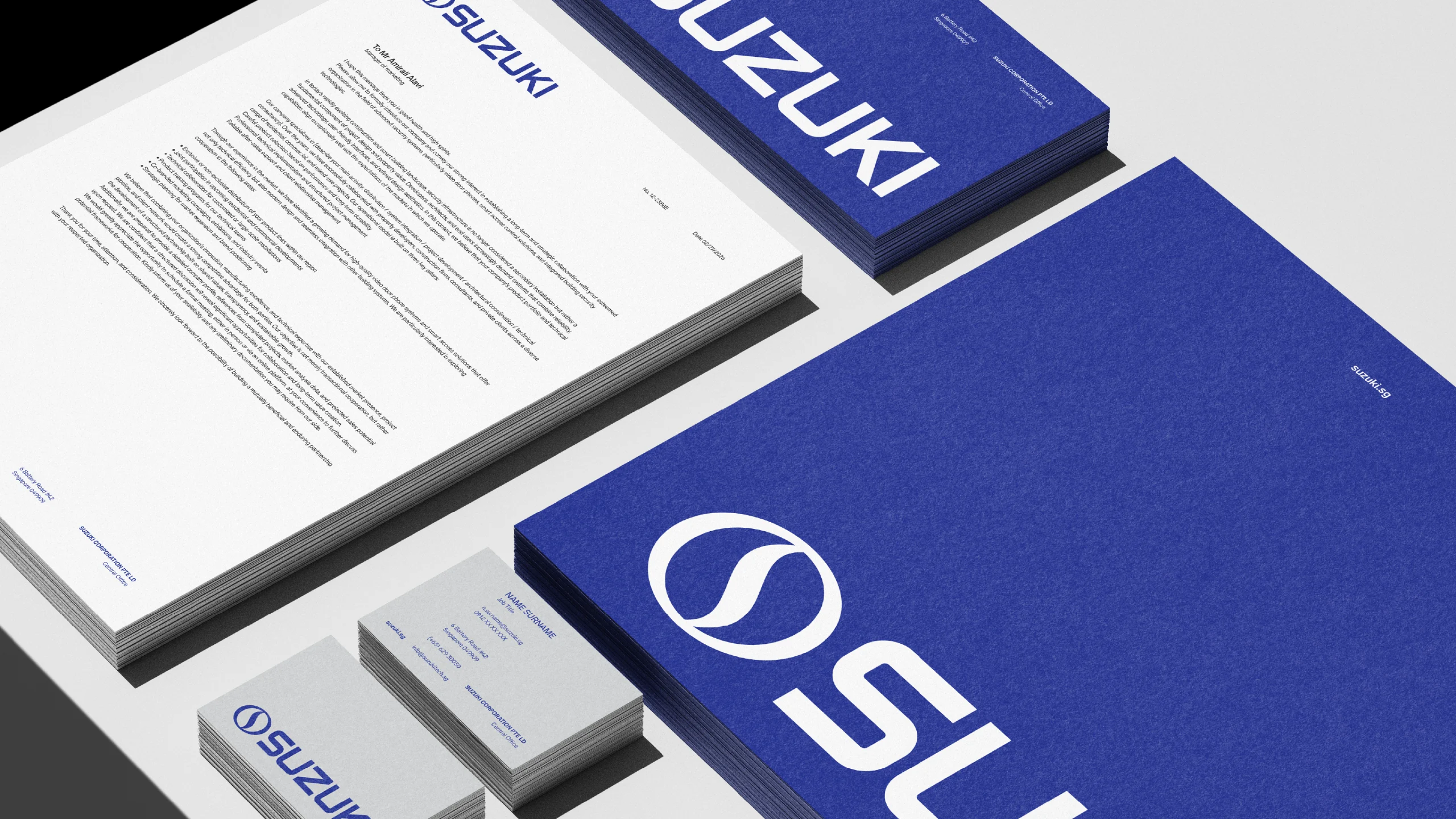
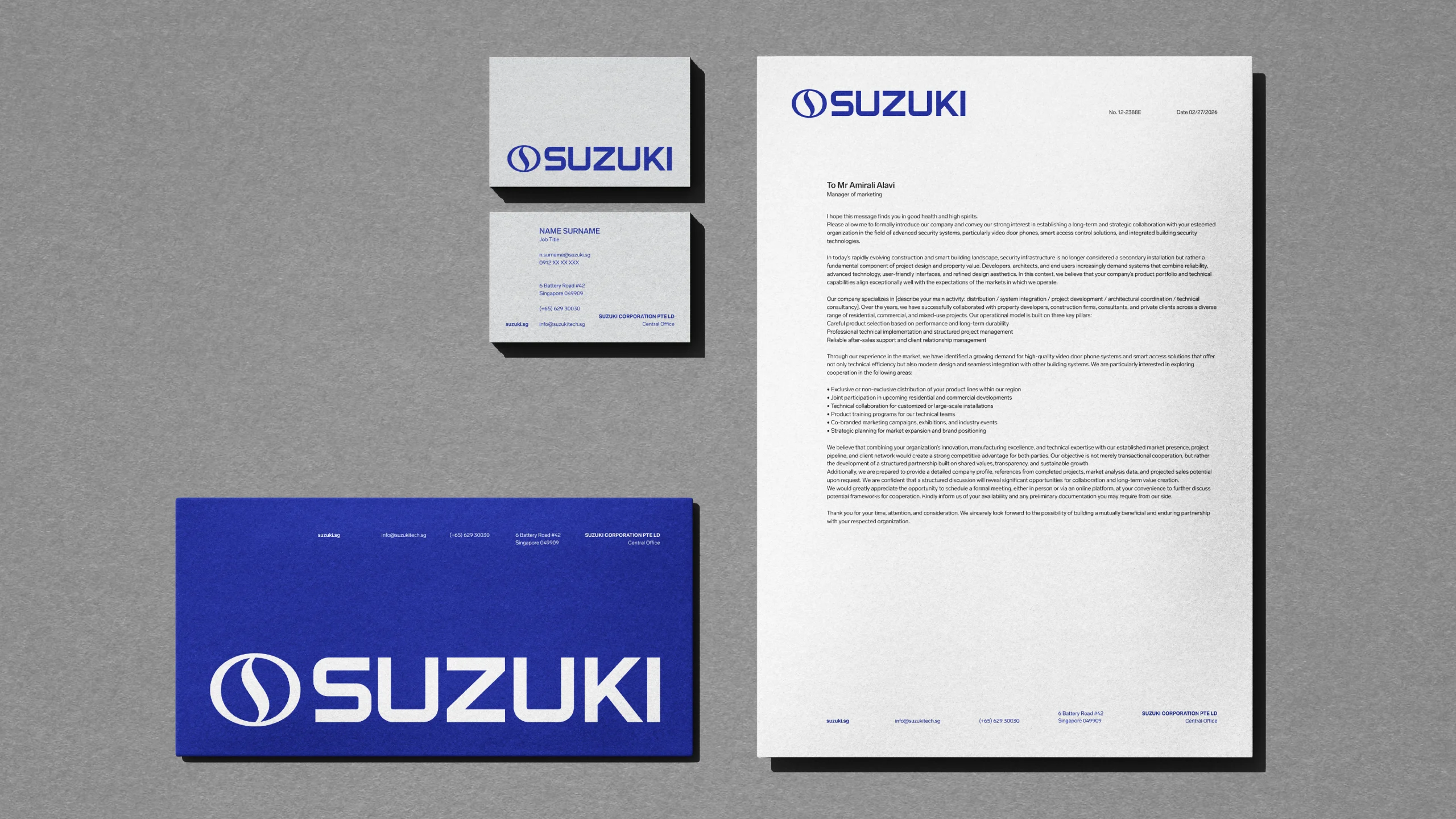
In Suzuki’s corporate brand identity system, stationery is designed using the brand’s predefined color palette to ensure visual consistency across all official materials. These items, including letterheads, envelopes and internal documents, are intended for office use and everyday brand correspondence. The overall layout approach emphasizes visual strength and structural balance, conveying a sense of stability, reliability and security in line with the brand’s core values.
Suzuki stationery includes A4 letterhead, A5 letterhead, business cards, large envelopes, and small envelopes.
Iconography
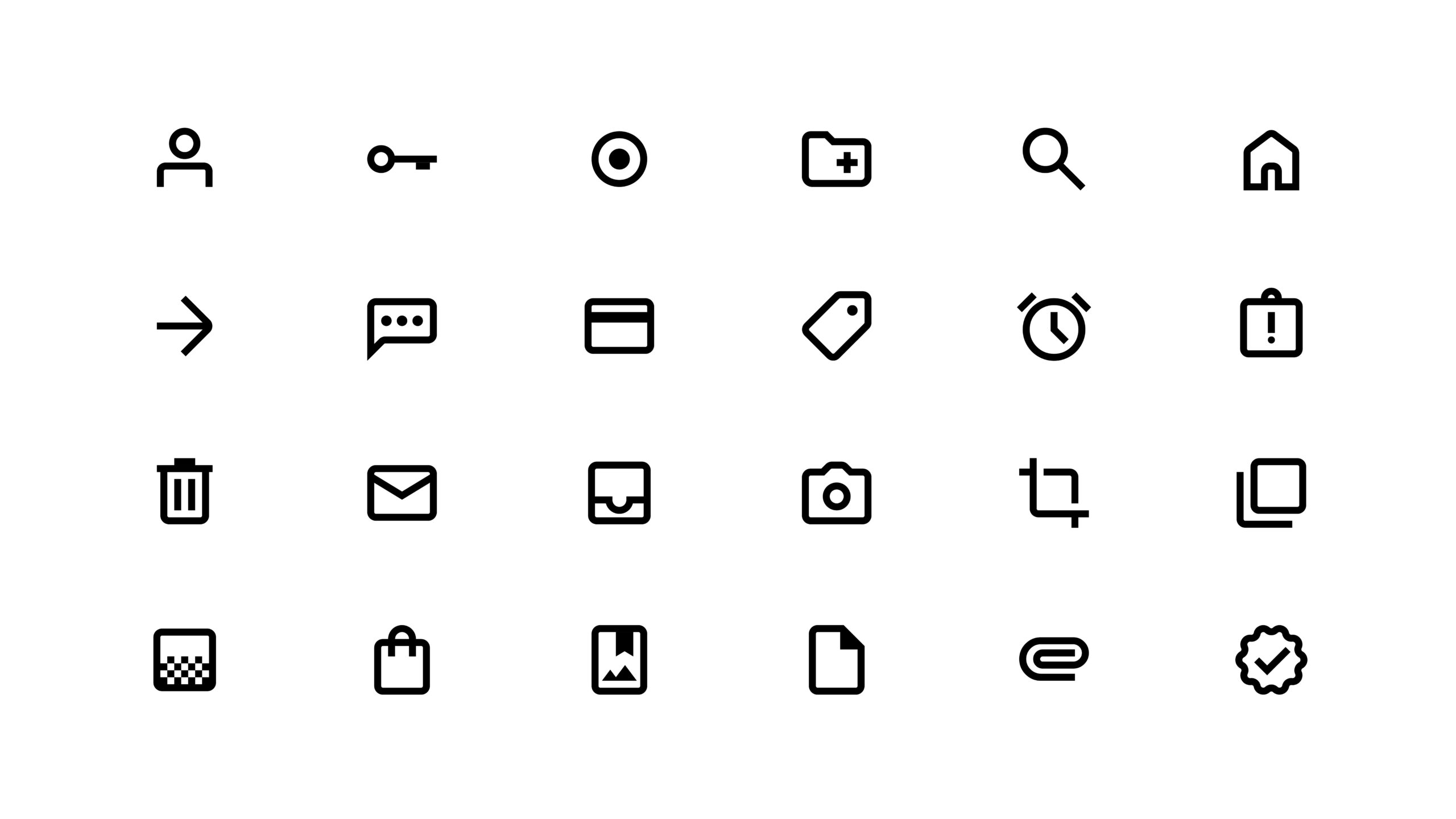
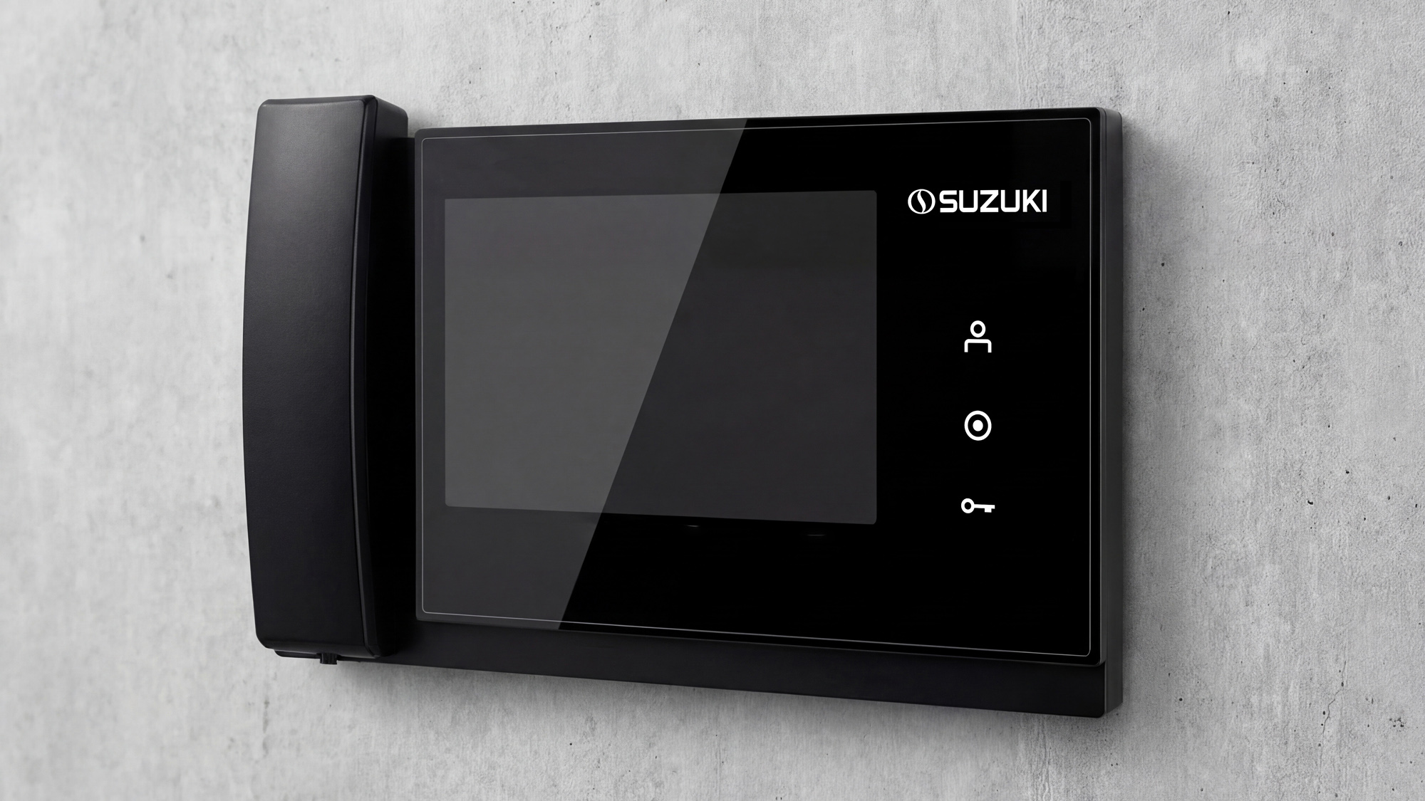
Iconography is a fundamental component of a visual identity system that provides clear and immediate communication across physical and digital touchpoints. In the Suzuki brand ecosystem, icons are used across user interfaces, info graphics, printed materials and products to enhance usability and visual coherence. A well-structured icon set enhances recognition while maintaining consistency with the brand’s official language. Based on functional requirements and usage contexts, three distinct icons have been designed to address specific applications within the system.







Social Media
Profile
The social media profile icon must remain clear, recognizable, and visually legible at small sizes. The brand sign should always be used on its own and must not be cropped or partially displayed. The lockup combining the wordmark and the sign should not be used for profile icons, as the reduced size makes the wordmark difficult to read. For optimal visibility, the icon should be applied using either a white sign on a blue background or a blue sign on a white background, ensuring strong contrast and consistent brand recognition across all platforms.


Layout
Social media layouts should maintain a clean and sophisticated visual style that reflects the brand’s identity. Designs must prioritize clarity, ensuring that messages are communicated in a direct and easily understandable manner. Visual elements should always support and relate to the core message of the content, avoiding unnecessary or decorative graphics that may distract from the communication. Consistency in layout, typography, and color usage should be maintained to reinforce a cohesive brand presence across all social media platforms.



Dress Code
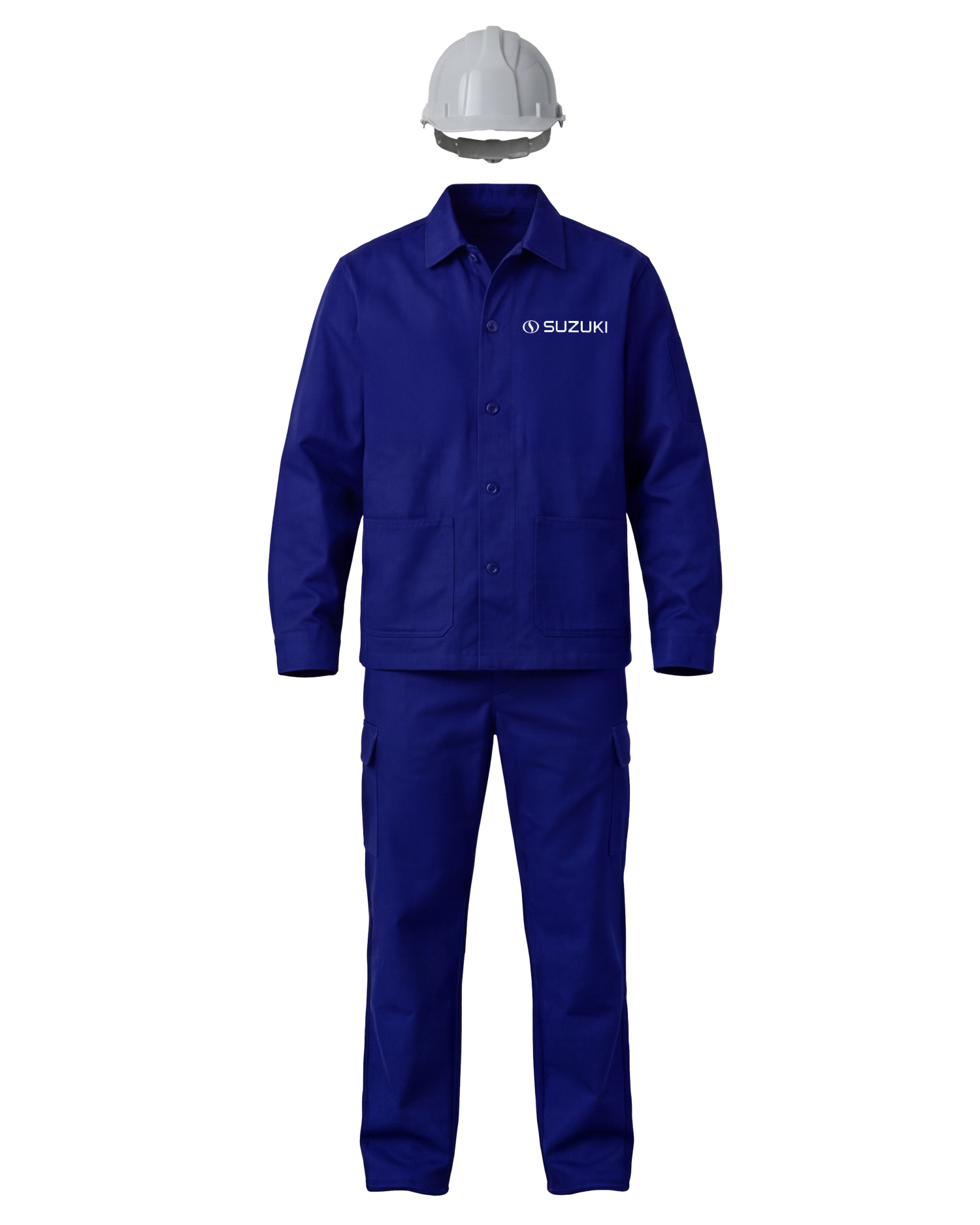
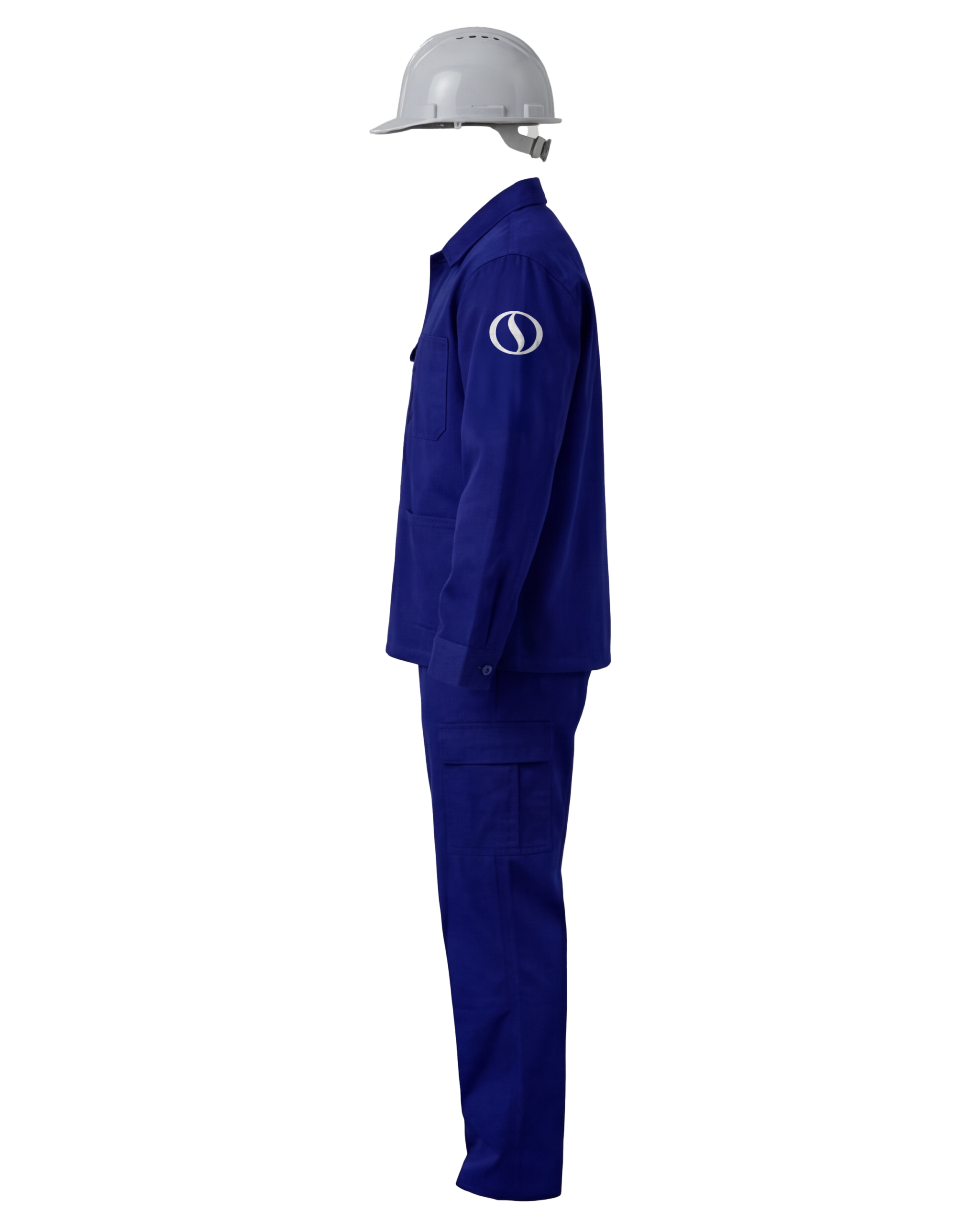
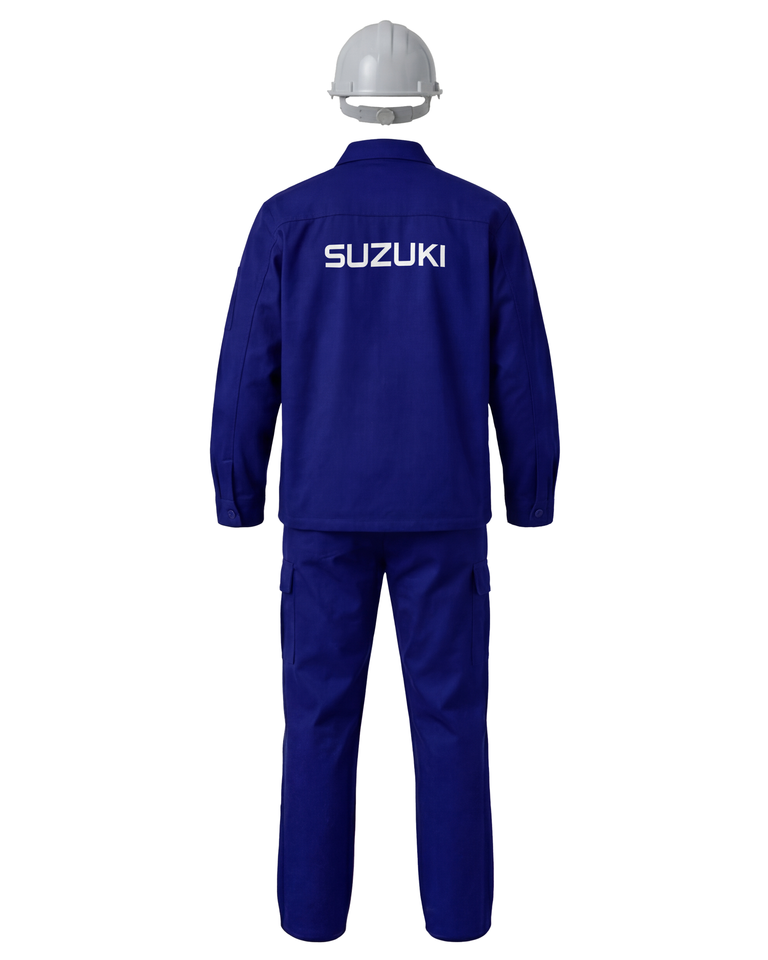
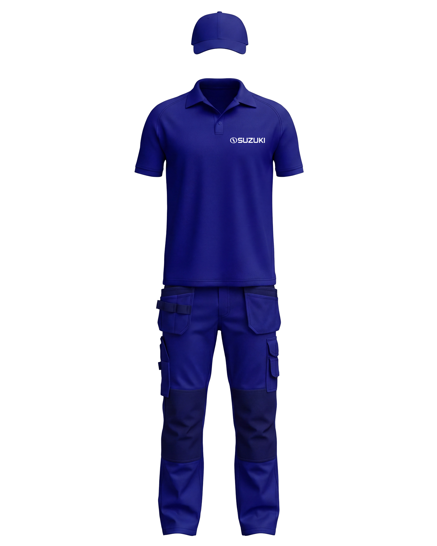
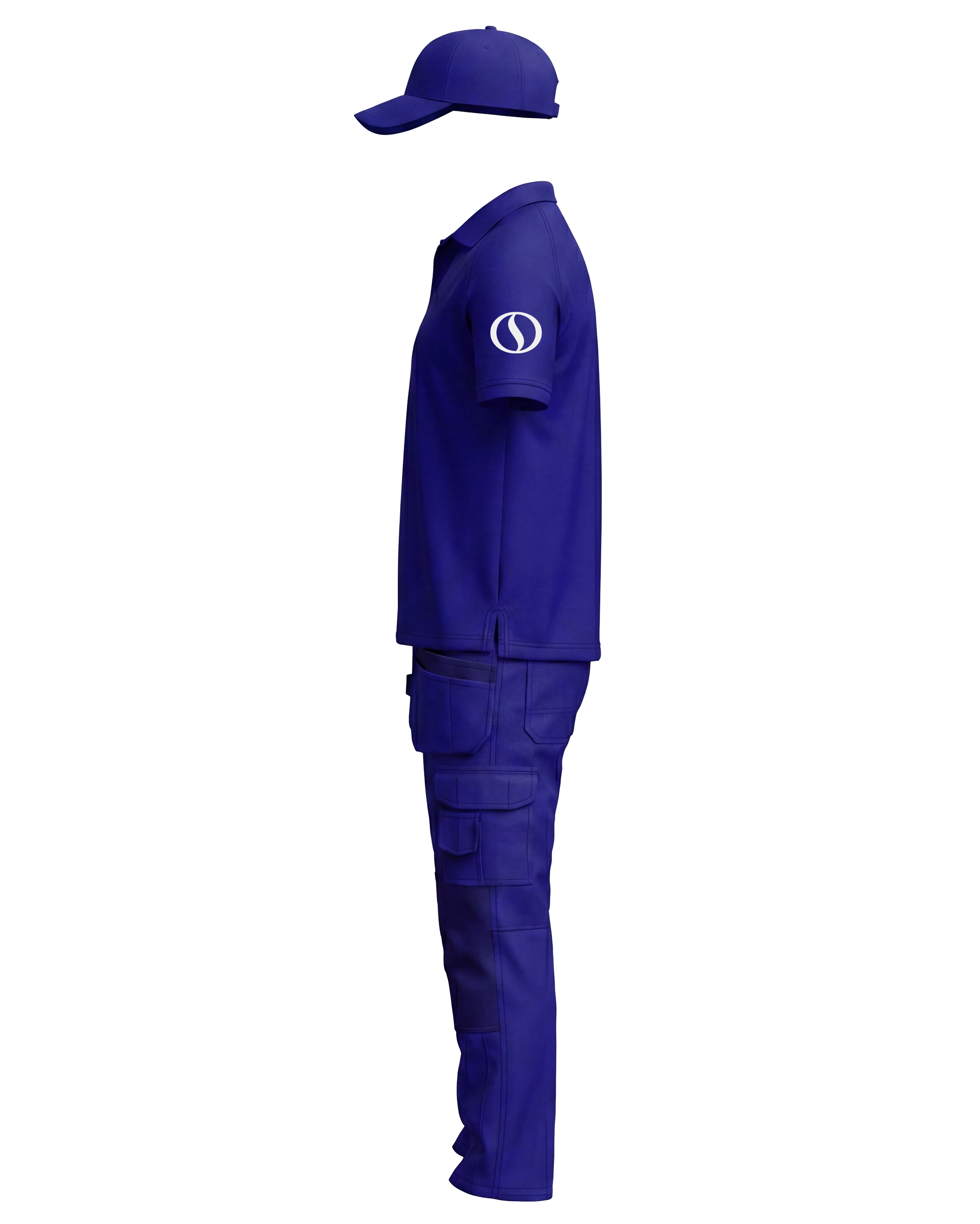
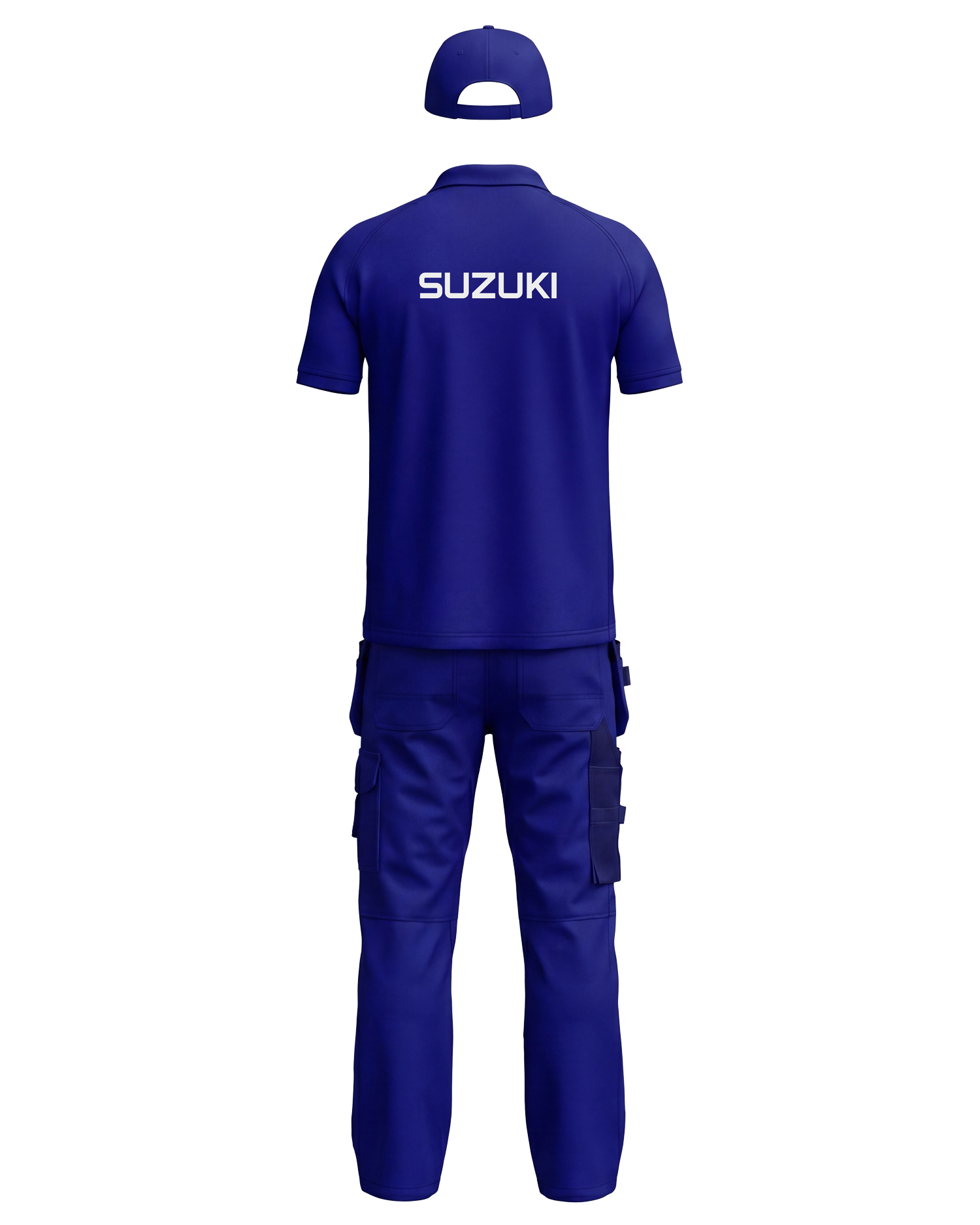
Our clothing designs follow a clean and uncluttered approach to maintain a professional and consistent brand appearance. Garments should primarily use solid colors—such as blue, grey, or black—selected according to functional requirements and the work environment. The company logo must always remain clearly visible and should not be obstructed or visually disrupted by unnecessary graphics, patterns, or decorative elements. This ensures brand recognition and preserves the integrity of the visual identity across all uniforms. The following example illustrates a standard outfit for manufacturing workers.
Vehicle Branding
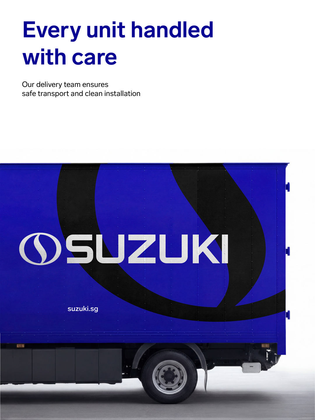
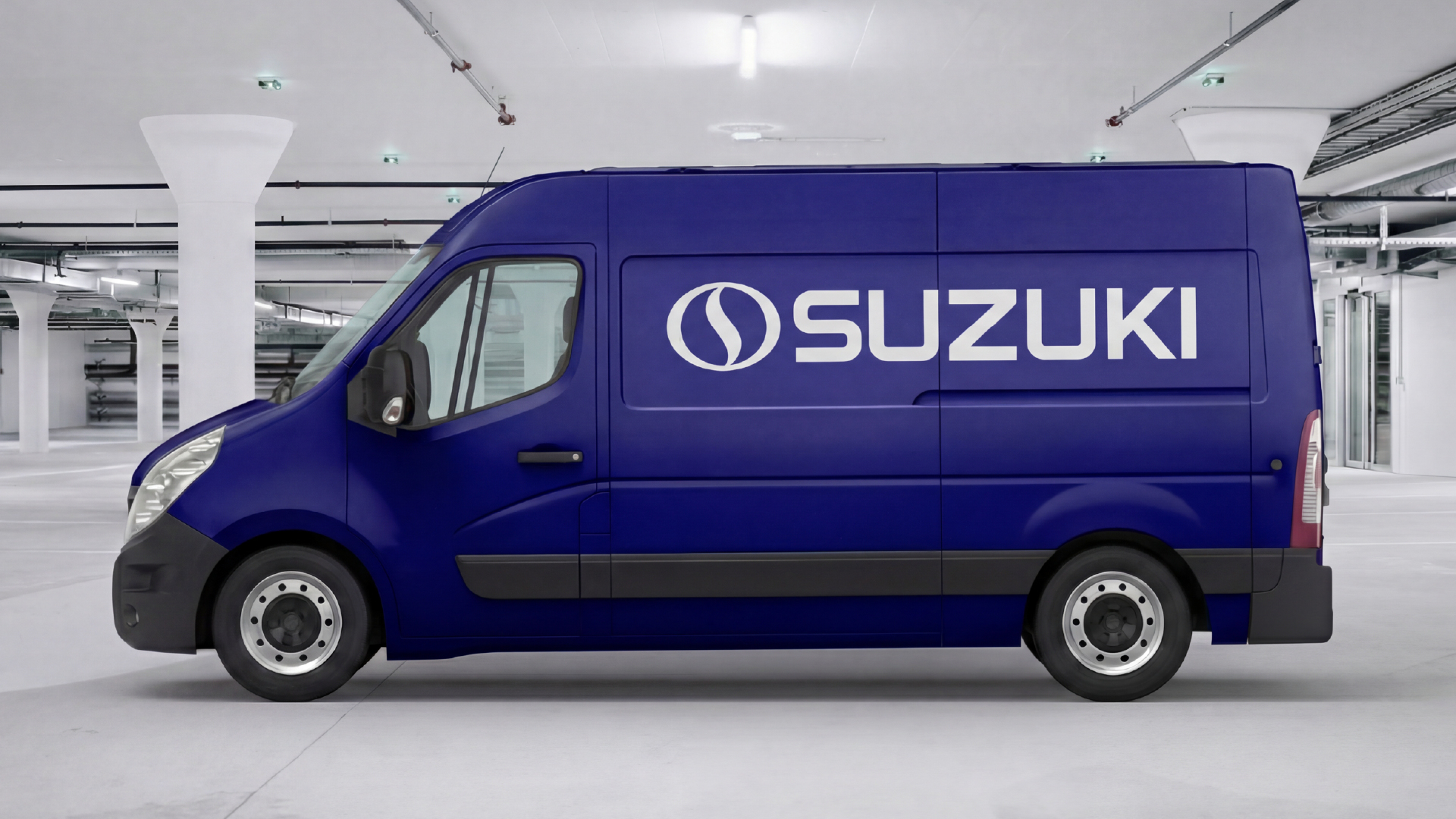
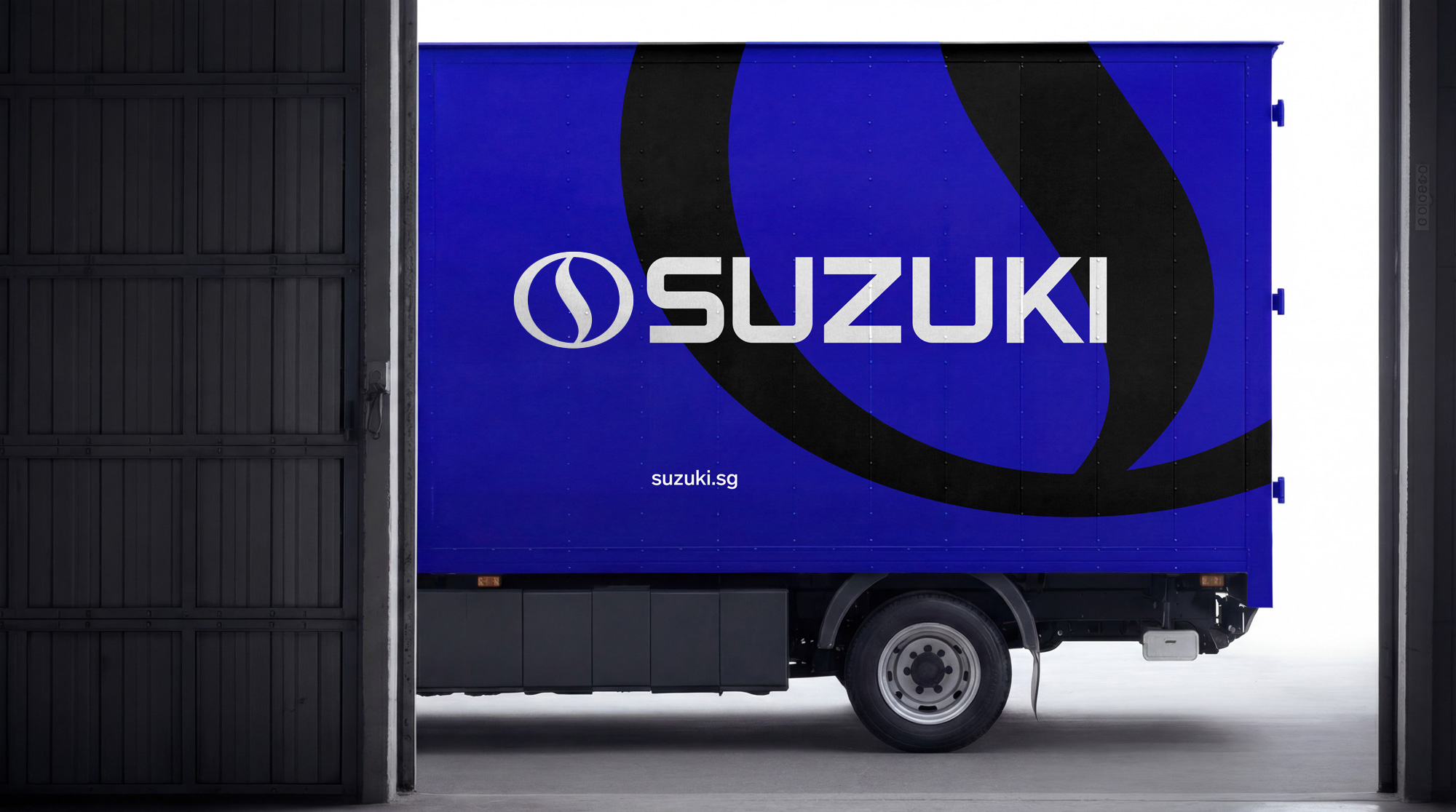
Our vehicle branding follows a clean and uncluttered design approach to ensure clear brand recognition and visual consistency. Vehicles should primarily use solid colors, preferably aligned with the brand’s official color palette. The company logo must always be clearly visible and positioned in a way that maximizes legibility from a distance. Additional graphics or elements should be kept minimal to avoid visual clutter and to maintain the clarity and integrity of the brand identity across all branded vehicles.
Environmental Branding
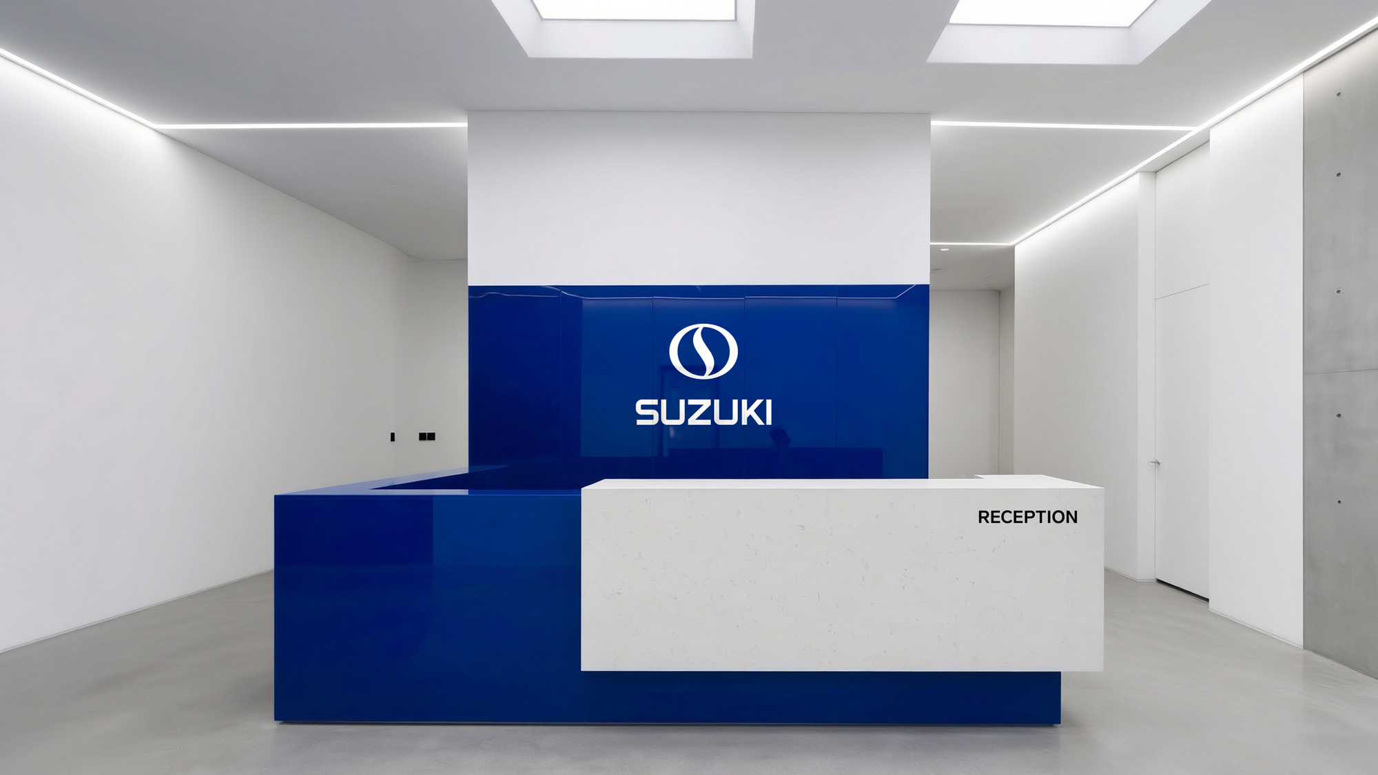
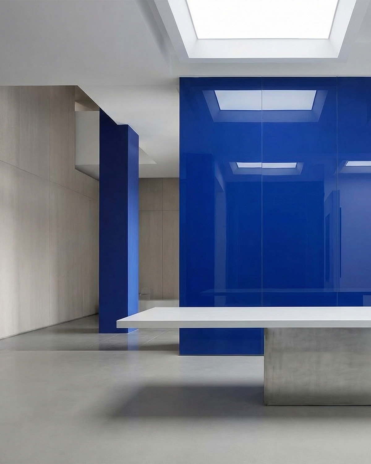
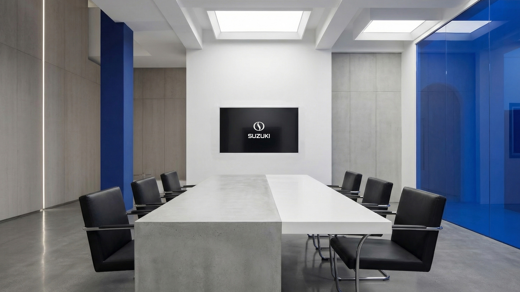
Our environmental design emphasizes bright, open spaces supported by a clean and modern material palette. Blue is used as an accent color to reinforce brand recognition, typically within environments dominated by white and silver tones. It should be applied sparingly and must not be used as the dominant color across large surfaces or spaces. Instead, it should highlight specific elements and create visual contrast within the environment. Materials such as aluminum, exposed concrete, and modern lighting fixtures are recommended to express the brand’s contemporary character and to maintain a cohesive visual identity across physical spaces.

Publication
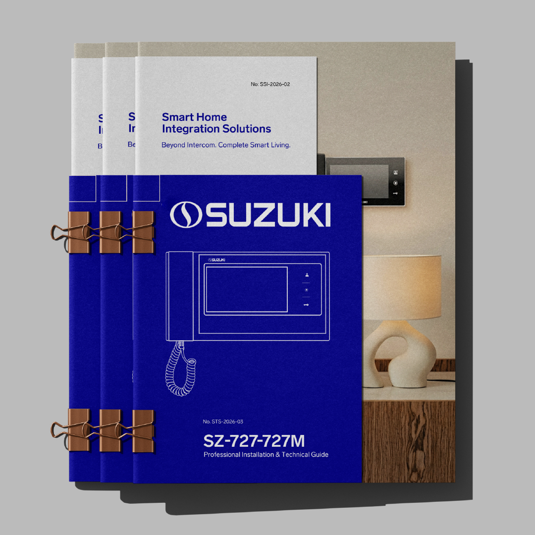
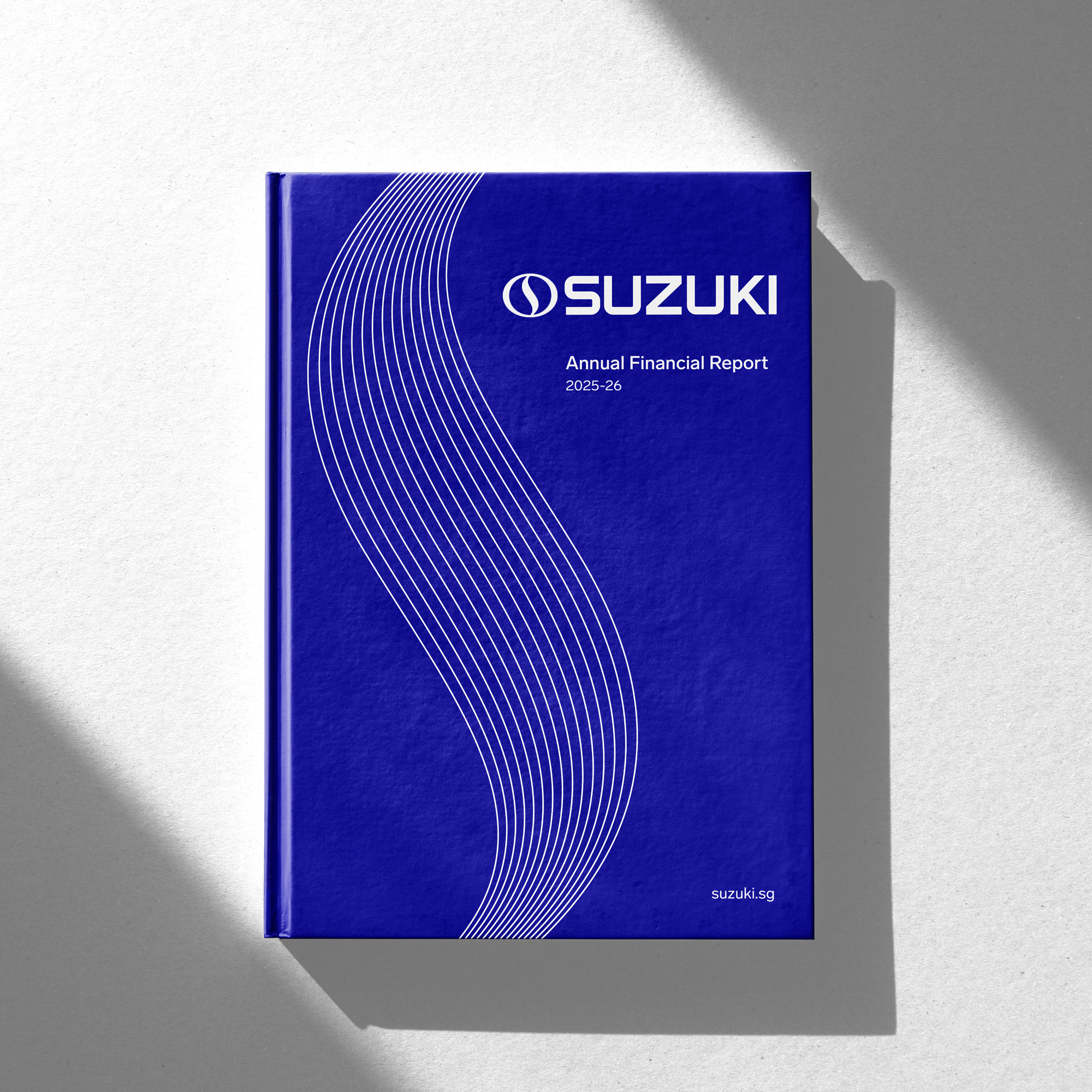
Our publication designs follow a clean and uncluttered visual approach to ensure clarity and consistency across all printed and digital materials. Solid colors, primarily drawn from the brand’s official color palette, should be used to create a strong and cohesive visual foundation. The company logo must remain clearly visible and properly positioned within each layout. A structured grid system should be used to organize content effectively and to maintain clear relationships between text and visual elements. Overall, layouts should be bold, minimal, and purposeful, allowing the content to be communicated in a clear and impactful way.
Imagery
Our visual imagery is organized into four distinct categories, each serving a specific communication purpose across different brand touchpoints.
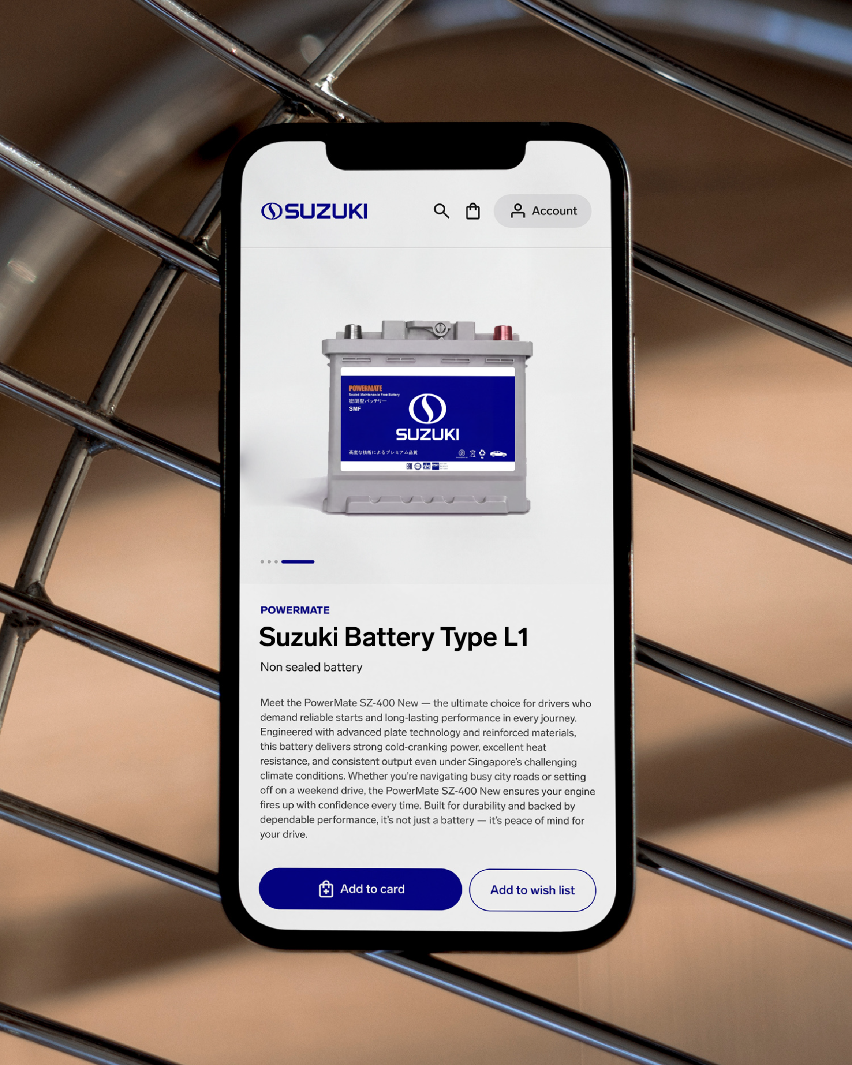
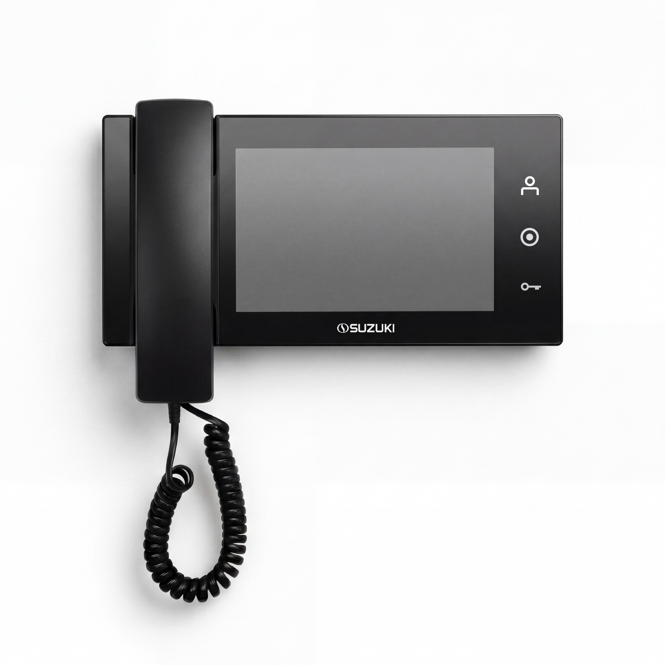
Isolated Photos are primarily used on the website and product packaging to present the product clearly and highlight its key features at a glance. These images typically show the product on a clean background with minimal distractions, allowing the viewer to quickly understand the product’s form and functionality.
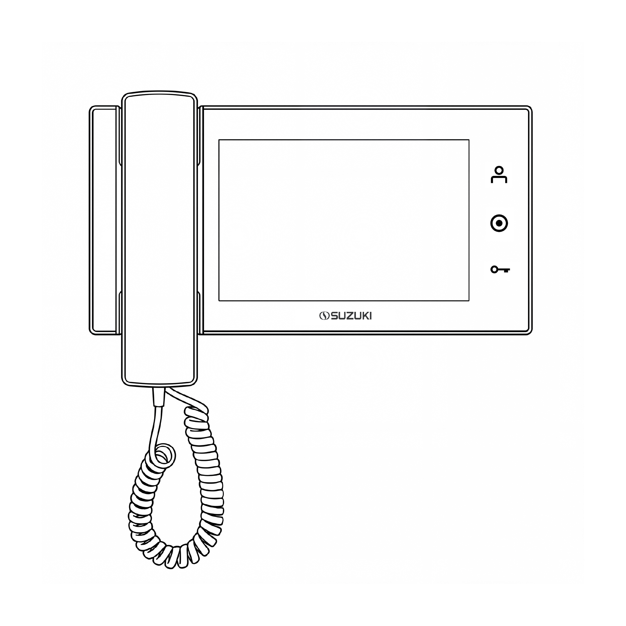
Technical Drawings are used in manuals and on packaging where visual clarity is more important than visual attraction. These illustrations should be precisely drawn using clean, consistent lines and minimal shading to ensure the product’s structure and components are clearly communicated.
Product Hero photos are cinematic, dramatic photographs designed to attract attention, particularly on retail packaging displayed on shelves. In these images, the product must remain the central focus and visual hero, with lighting, composition, and background elements supporting the product without overshadowing it.
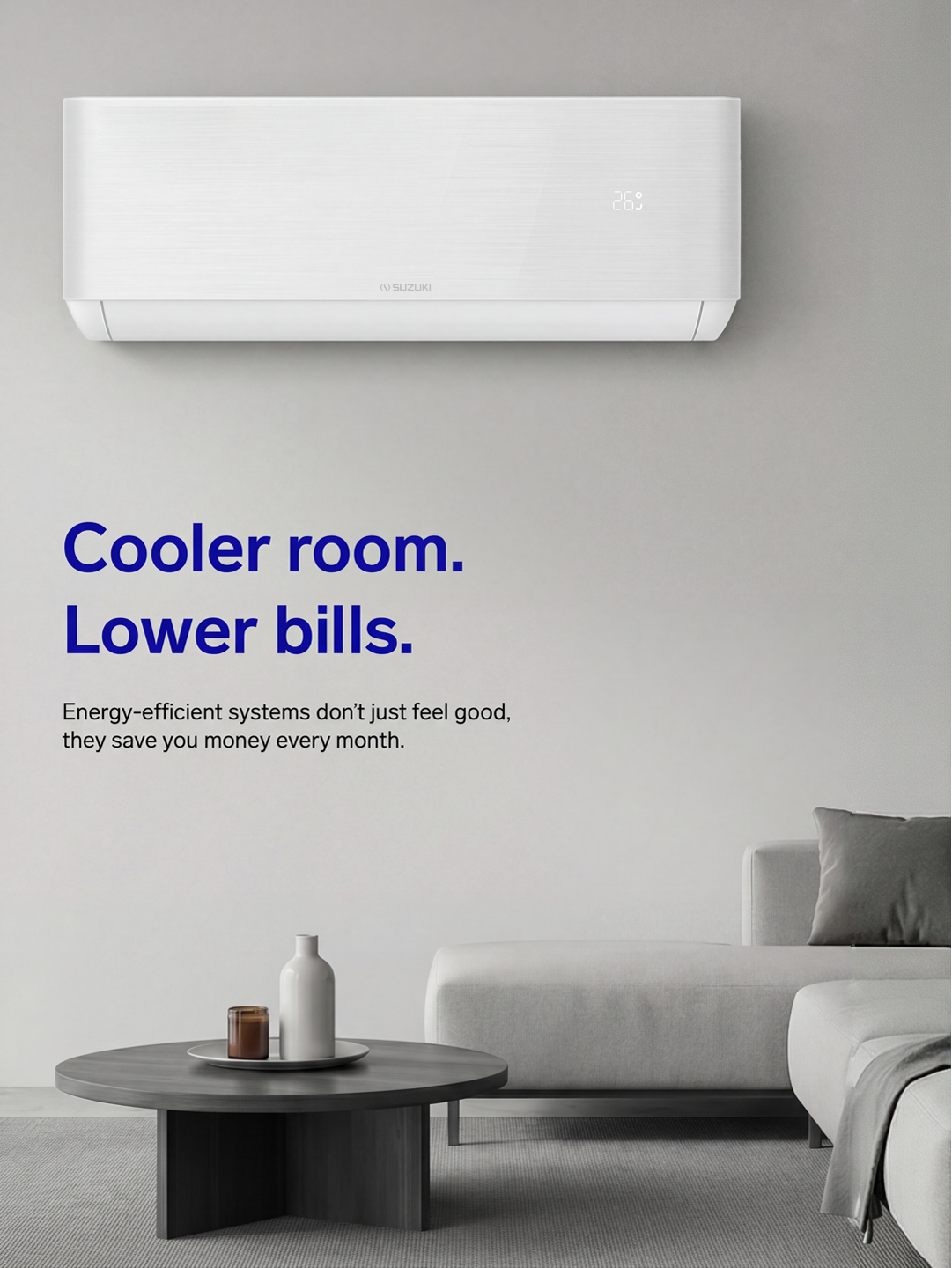
Lifestyle photos illustrate how the product fits into everyday life. These photographs show the product in real-world contexts, helping the audience understand how it can be used and the value it brings to their daily experience.


Packaging
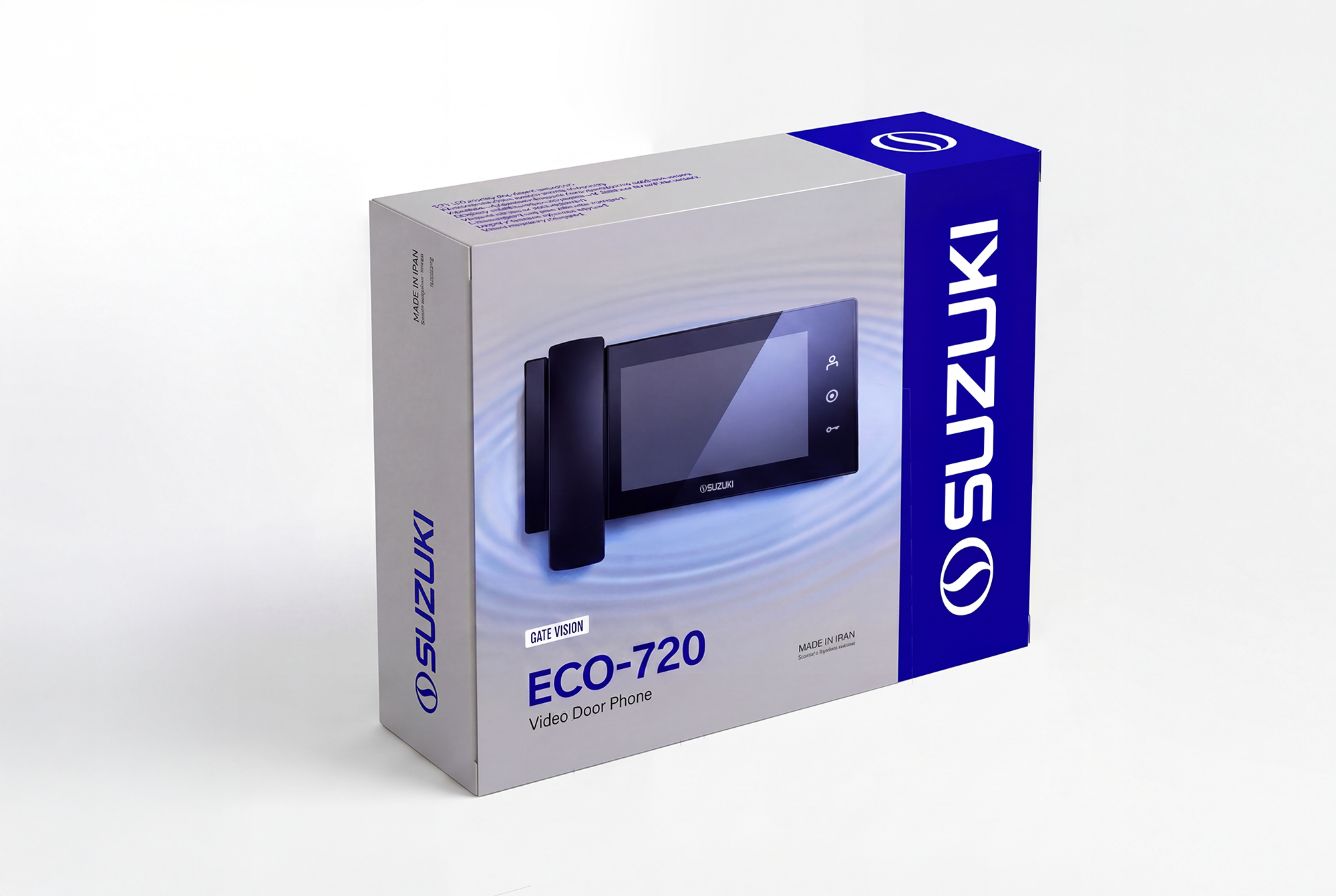
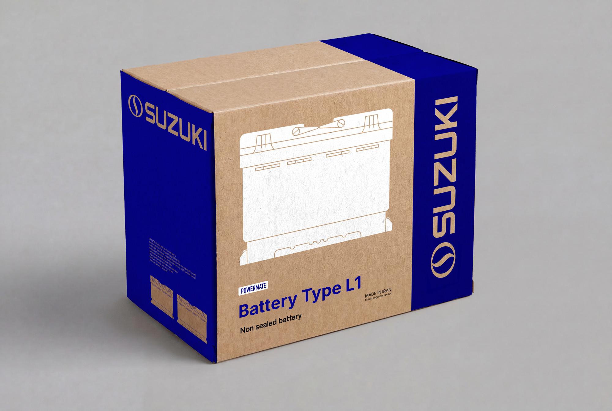
Our packaging system is designed to communicate product information clearly while maintaining a consistent brand presence. Brand core colors should be used across all packages, with blue applied at minimum as an accent element to reinforce brand recognition. The layout must remain clear and well-structured so that the audience can quickly identify the product category and model at a glance.
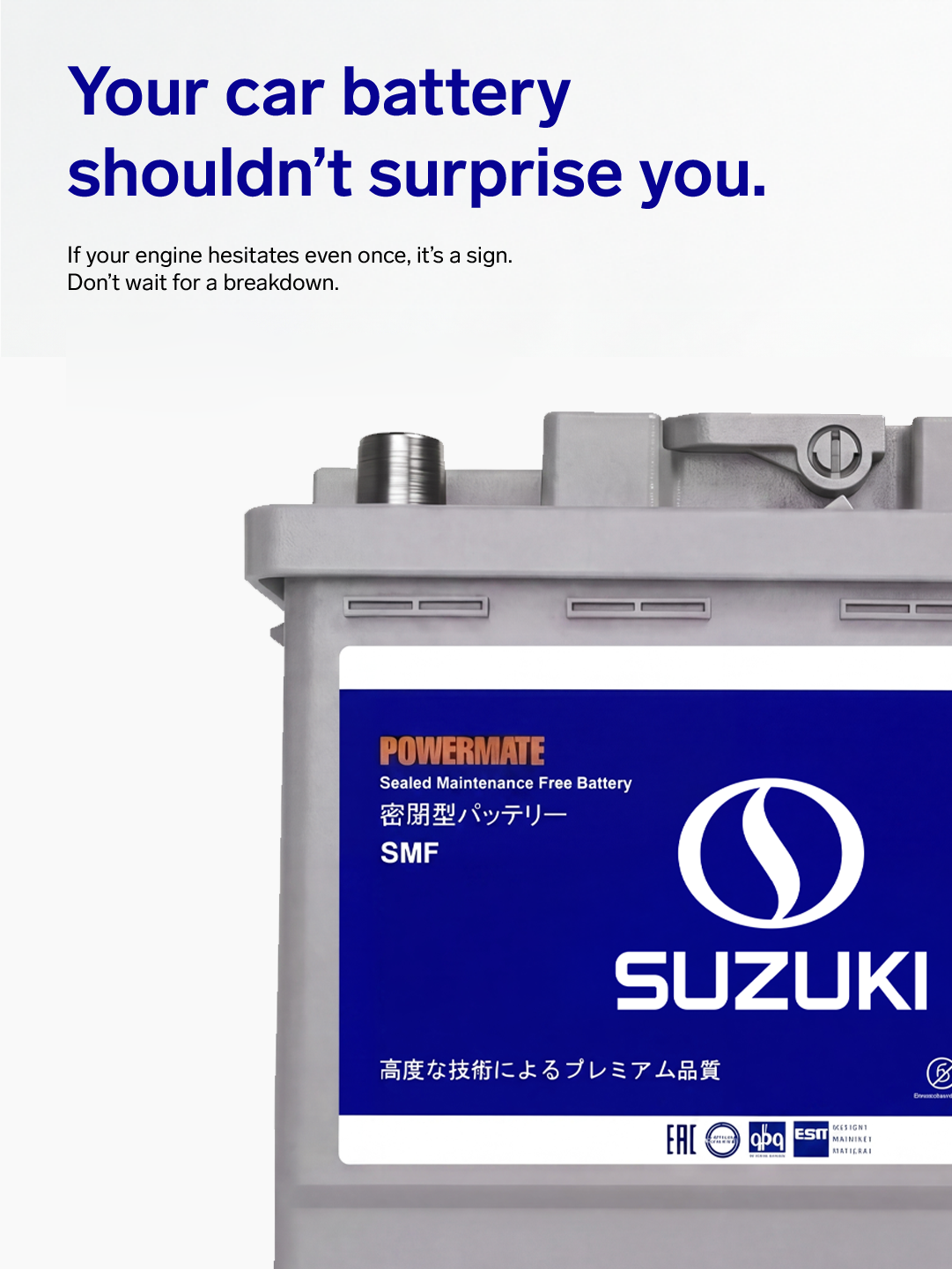
Packaging design may vary depending on the product’s retail context and its role in the purchasing decision. For products where packaging is not a primary point of sale—such as car batteries—simpler and more cost-efficient materials and printing methods may be used. In these cases, technical drawing visuals can effectively communicate product features while maintaining clarity and practicality.
For products where packaging plays a significant role in attracting customers, the design should be more visually engaging. These packages should emphasize strong visual appeal through refined layouts and the use of attractive imagery, such as product hero photography, to enhance shelf impact and support the purchasing decision.